I’ve come to a conclusion on pricing, and there will be two versions:
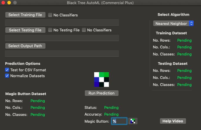
1. A Free Version that cannot be used for commercial purposes, that includes data normalization and nearest neighbor, including the “Magic Button”. This version will process the datasets in Swift, and is a standalone application that basically anyone can use.
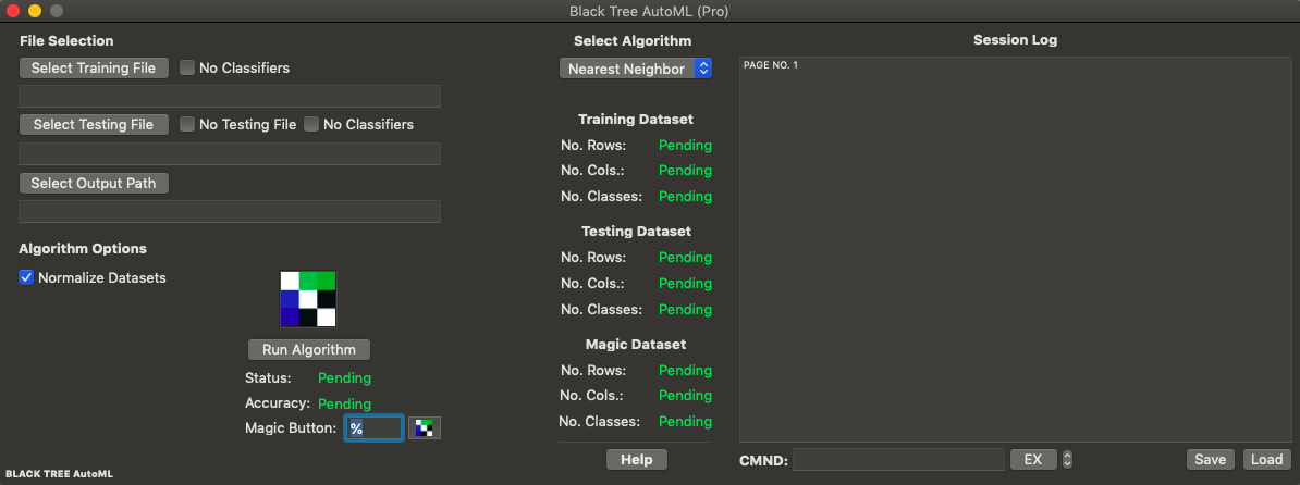
2. A Professional Version for $199, per user per year, that includes basically my entire library, and a Session Log that allows you to see the history of what you’ve done, save and load a prior session, and also inspect and operate on the dataset through commands entered into the GUI (see “CMND:”, below the Session Log screen, in the picture below). The actual A.I. code will run in Octave for the Pro Version, which means the runtimes are the same as my A.I. library, allowing for basically instant solutions to all core problems in deep learning, including prediction, clustering, image classification, video classification, object tracking, anomaly detection, time-series analysis, etc., though with the ease of a GUI written in Swift. The basic animating principle is to allow bright people that don’t know how to code, to execute sophisticated A.I. algorithms, in an interface comparable to Excel in complexity, and to allow actual data scientists to basically dispense with all routine tasks in deep learning. Though not finalized, this is roughly what both versions will look like when it’s done:
I’ve written the Octave code for what I’m calling a “Magic Button”, that allows you to search through predictions, and find a subset of the dataset that generates the desired accuracy. This is possible because of a confidence-based prediction algorithm, which assigns each prediction a confidence score, using a method I developed rooted in information theory. As you increase the confidence threshold, the number of predictions that satisfy the confidence threshold generally decreases, and the accuracy generally increases. You can read about the method in my paper, “Information, Knowledge, and Uncertainty“.
The “Magic Button” algorithm simply takes an argument which is an accuracy threshold, and searches through the resultant curve for all points that are within 2.5% of the argument. This allows you to say, e.g., I want 90% accuracy, and then the “Magic Button” will find all points on the accuracy curve that satisfy this criteria (within 2.5%), the tie breaker being the number of rows associated with each point on the accuracy curve (remember, the higher the accuracy threshold, the lower the number of rows that meet the threshold). In the Mac OS version, this will literally be a button (see above), with a field beside it, that allows you to say, I want a given accuracy, and then all rows that satisfy that criteria are automatically saved to a file as a CSV dataset, which in the picture above, is the “Magic Button Dataset”. This will allow you to isolate the highest performing subset of your dataset, which is part of the overall economic philosophy behind the software, which is to impose efficiency on the market for A.I., since you can then punt the problem rows to a custom model, allowing an admin, e.g., to take responsibility for not only all routine matters of machine learning, but all rows of any dataset that can be automatically solved for as a group, leaving only the balance to a data scientist. If of course you request 100% accuracy, and it’s just not possible, then you’re going to get an error, and that’s life, but as a general matter, this method allows you to achieve well over 90% accuracy, given any reasonably well-made dataset.
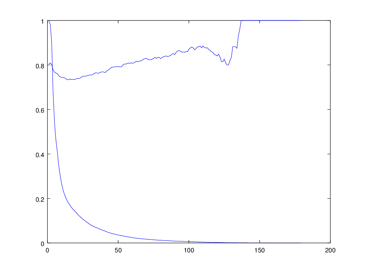
Attached is code that applies this method to the UCI Credit Dataset, all 30,000 rows, and above is a plot of accuracy as a function of confidence (the increasing curve), together with another curve that shows the percentage of the rows that satisfy the confidence threshold (the decreasing curve). The target accuracy for the Magic Button is set to 92.5%, and returns an actual accuracy of 93.103%, with only 29 rows surviving at that accuracy. Note that this is distinct from the software that initially tested the method, in that this software runs exactly once (because it has to as a commercial product), producing a jagged curve, whereas the previous software generated a curve on average, over hundreds of randomly generated training / testing dataset subsets, producing smoother curves (since it was testing a thesis). I will likely offer both in the final product, because random testing allows you to produce a smooth curve of accuracy as a function confidence, which you can then use when you don’t know the classifiers of the testing dataset, which is probably what’s going to happen in the real world. Specifically, you can say, e.g., this testing row has a confidence score of , and on average, rows with a confidence score of , have an accuracy of .
As a reminder, you can download Octave for free from GNU.
I’m of course working on my AutoML software, and in trying in to figure out what to offer at what price, I’ve rediscovered Nearest Neighbor, which I wrote about in my paper, “Analyzing Dataset Consistency“, proving a few results about its accuracy. Specifically, I showed that if your dataset is what I call “locally consistent”, in that classifications don’t change over some fixed distance, then the accuracy of the Nearest Neighbor algorithm will be perfect. As a practical matter, it means that for many real world datasets, the is accuracy is very high. As a consequence, I think it makes sense to offer only Nearest Neighbor and data normalization in the free version, and $5 per month version, with no clustering. Then, for significantly more money, I think about $100 per month, you get clustering, plus my confidence software, that allows you to “magically” increase accuracy, at the expense of the number of rows that satisfy the stated confidence criteria. I think this is both economically fair and practical, because what it does, is gives people commercially viable software based upon known technology, at a low price per month, in a convenient GUI format. Then, for real money, you get something that is geared towards an audience that is trying to capitalize directly from predictions (e.g., making credit decisions), as opposed to maybe making routine use of basic machine learning, as an expense, not a driver of revenue. Stepping back, I think the big picture is, my software imposes efficiency on the market for A.I., because routine machine learning can be totally commoditized, allowing an admin to simply process CSV files all day, and when problem datasets arise (i.e., they produce low accuracy), even if you’re too cheap to buy the better version of my software, you can kick that dataset up to a real data scientist, who will then spend more time on the hard problems, and basically no time, on the easy ones.
I’m not saying I’ll change my mind, but if you think that this is a bad idea commercially, shoot me an email at charles dot cd dot davi at [gmail dot com].
I’m in the process of implementing my software for MacOS for commercial sale in the Apple App Store, and in particular, I’m marketing my confidence-based prediction as a “Magic Button”, because it actually does increase accuracy radically, as a function confidence. The issue is however, that I’ve tested it on average, over a large number of iterations, to be sure that I haven’t relied upon anomalies –
I.e., I tested it on several hundred random training / testing datasets, given an entire dataset.
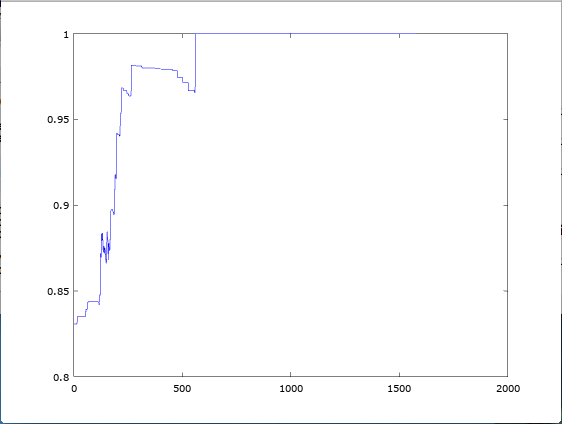
This produced increasing accuracy, on average, as a function of confidence, regardless of the dataset, which suggests my ideas are correct, as an empirical matter. However, when applying this software in the real world, you have to be right the first time, not on average, because it doesn’t matter if your ideas are right, in general, it matters that they can be applied, every time. And so this led to a little tinkering with the equation for delta, and the result is awesome, consistently producing 90%+ accuracy, the first time, not on average, regardless of the dataset. Below is a plot of accuracy as a function of confidence, for the UCI Parkinson’s Dataset, which you’ll note is not as smooth as the curves produced in my previous note, because there’s no averaging, this is one shot, and it’s right.
I’ve updated the Free Version of Black Tree AutoML for MacOS, the major improvement being that if your dataset isn’t in CSV format, you’ll see an error message, rather than letting the program simply crash. It’s not a functional improvement, but it’s helpful, since it’s annoying and unprofessional to simply let a program crash, though it does add somewhat to the runtime, since every single entry in the dataset is scanned to ensure it can be understood by the prediction algorithm.
As a reminder, you can contribute to my Kickstarter Campaign, and in any case, all of the software should be up and running on the Apple App Store by the middle of February!
Enjoy!
UPDATE: There is apparently something wrong with DropBox at the moment, but I will keep trying throughout the day, and tomorrow to upload the file.
I’ve applied my knowledge-based prediction algorithm to the UCI Credit Dataset (which I’ve attached, already formatted), and the results are the same as always, peaking near 100% accuracy (using only 3,500 rows). What’s interesting is the use of ordinal values, in this case levels of education. Though I didn’t explicitly do it in this case, what you could do is simply use my normalization algorithm as applied to those dimensions that contain ordinal values. This will cause the normalization algorithm to use different orders of magnitude for the ordinal dimensions, thereby solving for the appropriate spacing between ordinal values. So for example, if the possible ordinal rankings are (1, 2, 3), then this application of the normalization algorithm will test, e.g., (10, 20, 30), (100, 200, 300), etc., each of which will produce different accuracies, with the best one selected.
Below is a plot of accuracy as a function of knowledge, which you can read about in the first paper linked to above:
Note that this will not work for truly arbitrary labelled data, where the values have no obvious numerical meaning (e.g., colors). In that case, you could iterate through different ordinal rankings of the labels (i.e., permutations), and then use the normalization method to solve for the best numerical values for the labels for each ordinal ranking. Nonetheless, attached is command line code that both normalizes and runs predictions on the UCI Credit Dataset. This is going to be included in some commercial release of my software, but given that it’s so powerful, I’m probably not going to release it on the Apple App Store as part of my Kickstarter Campaign (at least not this version of it).
As noted, I’m writing a MacOS version of my core A.I. software, and because Swift is not vectorized, it’s not exactly the same, which requires me to reevaluate my code. In this case, I took a look at my normalization script, and it’s so complicated, I simply redid it in Octave, for the sole of purpose of rewriting it in Swift (see attached). The idea is the same:
You cluster the dimensions by number of digits, and then iteratively reduce the largest dimensions (i.e., the cluster that contains the largest dimension) by dividing by powers of ten, and test the accuracy at each scale. This is just an easier way of expressing the same idea.
I was reminded of a result I first saw in Mathematical Problems and Proofs, that shows that the generating function for the Fibonacci Sequence implies that the sum over all Fibonacci numbers is .
There’s a very good proof here in the first response to the question:
Simply set , and you have the sum in question, which is plainly .
Of course, the sum diverges, which initially lead me to view this result as a mere curiosity, though it just dawned on me, that there’s an additional problem, that I think is tantamount to a paradox:
Let be the set produced by the union of disjoint sets of sizes , where is the i-th Fibonacci number. It must be the case that has a cardinality of . More troubling, addition between integers can be put into a one-to-one correspondence between unions over disjoint sets, and thus, we have an apparent paradox.
To be clear, this has nothing to do with convergence –
It should in fact sum to infinity, and it does not, whereas a perfectly corresponding union over sets does.
This example implies that the rules of algebra fail in some cases given an infinite number of terms, whereas set theory does not. One initial observation, addition is plainly not commutative with an infinite number of terms. For example, consider an alternating sum of . If you sum from left to right, you can cause the sum to oscillate near any finite value, or to diverge to positive or negative infinity, without changing the terms at all, simply changing their order. So as a consequence, it must be the case that the rules of algebra require reconsideration in the context of an infinite number of terms. I’m not suggesting that this is what’s driving the apparent paradox above, but rather pointing to the general issue that mechanical application of the rules of algebra to an infinite number of terms is not appropriate, and this example plainly demonstrates that fact.
Attached is some code that makes use of a measure of correlation I mentioned in my first real paper on A.I. (see the definition of “symm”) that I’ve finally gotten around to coding as a standalone measure.
The code is annotated to explain how it works, but the basic idea is that sorting reveals information about the correlation between two vectors of numbers. For example, imagine you have a set of numbers from 1 to 100, listed in ascending order, in vector , and the numbers -1 to -100, in vector , listed in descending order. This would produce the following plot in the plane:
Now sort each set of numbers in ascending order, and save the resultant mappings of ordinals. For example, in the case of vector , the list is already sorted in ascending order, so the ordinals don’t change. In contrast, in the case of vector , the list is sorted in descending order, so ordinal 1 gets mapped to the last spot, ordinal 2 gets mapped to the second to last spot, and so on. This will produce another pair of vectors that represent the mappings generated by the sorting function, which for vector will be , and for vector will be , where is the number of items in each vector. Therefore, by taking the difference between the corresponding ordinals in and , we can arrive at a measure of correlation, since it tells us to what extent the values in and share the same ordinal relationships, which is more or less what correlation attempts to measure. This can be easily mapped to the traditional scale, and the results are exactly what intuition suggests, which is that the example above constitutes perfect negative correlation, an increasing line constitutes perfect positive correlation, and adding noise, or changing the shape, diminishes correlation.
Also attached is another script that uses basically the same method to measure correlation between numerical data and ordinal data. The specific example attached allows you to measure which dimensions in a dataset (numerical) are most relevant to driving the value of the classifier (ordinal).
 , and on average, rows with a confidence score of
  .
.

 .
. , and you have the sum in question, which is plainly
  be the set produced by the union of disjoint sets of sizes
  , where
  is the i-th Fibonacci number. It must be the case that
  . More troubling, addition between integers can be put into a one-to-one correspondence between unions over disjoint sets, and thus, we have an apparent paradox.
 . If you sum from left to right, you can cause the sum to oscillate near any finite value, or to diverge to positive or negative infinity, without changing the terms at all, simply changing their order. So as a consequence, it must be the case that the rules of algebra require reconsideration in the context of an infinite number of terms. I’m not suggesting that this is what’s driving the apparent paradox above, but rather pointing to the general issue that mechanical application of the rules of algebra to an infinite number of terms is not appropriate, and this example plainly demonstrates that fact.
 , and the numbers -1 to -100, in vector
  , listed in descending order. This would produce the following plot in the
  plane:
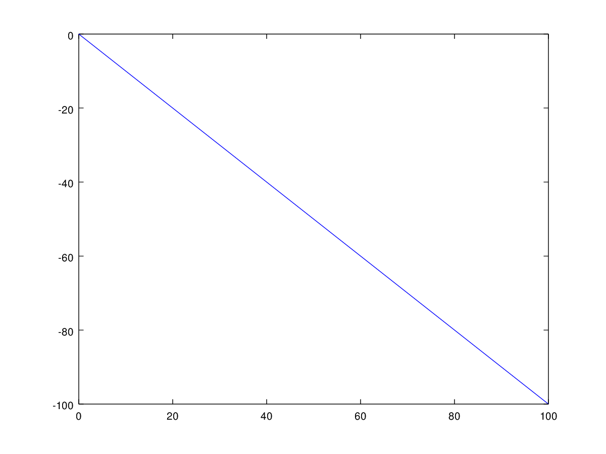
 , and for vector
  , where
  is the number of items in each vector. Therefore, by taking the difference between the corresponding ordinals in
  and
and  , we can arrive at a measure of correlation, since it tells us to what extent the values in
 ![[-1,1]](https://s0.wp.com/latex.php?latex=%5B-1%2C1%5D&bg=ffffff&fg=444444&s=0&c=20201002) scale, and the results are exactly what intuition suggests, which is that the example above constitutes perfect negative correlation, an increasing line constitutes perfect positive correlation, and adding noise, or changing the shape, diminishes correlation.
scale, and the results are exactly what intuition suggests, which is that the example above constitutes perfect negative correlation, an increasing line constitutes perfect positive correlation, and adding noise, or changing the shape, diminishes correlation.