There’s apparently some debate about whether humans come from Africa, or from Asia, and after not reviewing much of the literature (being honest), and instead conducting my own research in genetics, I’ve concluded that we all come from Africa, and that many of us migrated to Asia, possibly Central Asia, and then some of us migrated from Asia, back to Africa and Northern Europe, and the Pacific. See, A New Model of Computational Genomics, generally. Specifically, it looks like some Scandinavians, Thai, Japanese, Khoisan, and Nigerian people are all very closely related to each other, to the point of 90% plus matches on the maternal line. I’ve shown that mtDNA must carry information about the paternal line as well, since my software can predict ethnicity with about 80% accuracy. As a consequence, it follows, that some Scandinavians, Thai, Japanese, Khoisan, and Nigerian people are all very closely related to each other, as a general matter. This is not to the exclusion of other people, it’s just most obvious in these populations. Therefore, I am of the belief that humanity began in Africa, which is in my opinion based in archeology, and not genetics. Specifically, that archeological evidence of early humans is most prevalent in Africa. Below is a plot from Wikipedia that shows the global distribution of tools associated with archaic humans from about one-million years ago, to about one-hundred-thousand years ago.
In contrast, the migration-back hypothesis, is in my opinion, rooted in genetics. Specifically, that you find simply inexplicable connections between global populations, in particular, certain Northern Europeans, Africans, and Asians. These relationships make no sense in the context of known history, and instead, make perfect sense, in the context of genetics, and common sense. Why did the early Egyptians appear to be Asian? Why do the Khoisan to this day appear to be Asian? Why are Stave Churches plainly reminiscent of Thai temples? One simple solution, is that all of these people are part a single group of people, that migrated back to the West, from Asia. On the left is a Norwegian Stave Church, to its right is a Thai Temple, after that is Menkaure and Queen Khamerernebty II (c. 2,530 BCE), courtesy of MFA Boston, after that Nefertiti (c. 1,370 BCE), courtesy of Wikipedia, and on the bottom right is Cleopatra (c. 50 BC), courtesy of Wikipedia, who plainly looks nothing like the rest of them.
I’ve noted before that mtDNA must provide information about the paternal line, since I’ve written software that can predict ethnicity with about 80% accuracy, without any filtering for confidence, using mtDNA alone. See, A New Model of Computational Genomics [1], generally. Because ethnicity is a combination of both paternal and maternal ethnicity, there’s just no argument to the contrary – the accuracy would otherwise be horrible. I’ve developed reasonable hypotheses to explain this, specifically, the selection of particular maternal lines is probably a decent explanation for the fact that mtDNA must carry information about paternal ethnicity. That is, males in a given geography prefer particular females, for whatever reason, and that produces a unique distribution of maternal lines, which in turn, identifies the paternal lines.
However, some of my results suggest more direct influence from the paternal line. Specifically, it seems at least plausible that males select females that have mtDNA bases in common with them, which would over many generations cause the two maternal lines to fuse into one. For example, a Norwegian individual, when selecting among mates in Sweden, will select the mate that has the maximum number of mtDNA bases in common. This behavior would, over time, cause both Norwegian and Swedish mtDNA to combine, since each generation would mate on the basis of the maximum number of bases in common. This is course a random example, but I saw some evidence of this in the Danes, who seemed to be a mix between Swedes and Norwegians.
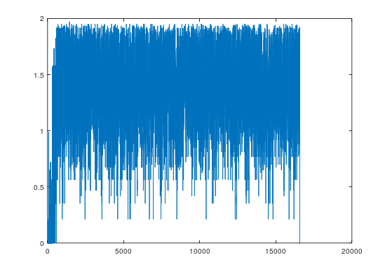
I’ve developed an experiment and software to test this hypothesis. Specifically, some populations are mixes between modern and archaic humans, and I’ve tested whether the introduction of archaic mtDNA impacts the modern mtDNA of the population in question. The experiment I’ve come up with is to test which Mongolians are at least a 60% match to Denisovans. There are 19 complete Mongolian genomes in the dataset, 8 Denisovan genomes, and 1 Heidelbergensis genome. All genomes are complete mtDNA genomes taken from the NIH Database, complete with provenance files for each genome linking to the genome descriptions. This gives each of the Mongolians genomes 8 chances to match with a Denisovan, and if a single match occurs, it is included in a list of genomes that are treated as in essence, Denisovan. Of the 19 Mongolian genomes, 4 were a match to at least 1 Denisovan. This leaves 15 genomes that did not match. The question is then, do the remaining 15 genomes have more in common with the Denisovans than a population that has no clear relationship to the Denisovans?
This is superficially impossible, because mtDNA is inherited directly from the mother to the child, typically with no mutations at all. However, my hypothesis is that males select females on the basis of genetic similarity. Specifically, that males attempt to maximize the number of bases in common with their female mate. This will, after generations, cause the mtDNA of the paternal line to converge with the mtDNA of the maternal line. Specifically for this experiment, it should be the case that the non-Denisovan Mongolian genomes have more bases in common with Denisovans than some other population that has no clear relationship to Denisovans. As a reference population with no clear relationship to either Denisovan or Heidelbergensis, I selected the English, and there are 9 English genomes in the dataset. The results suggest that I’m correct, since the average match count between a non-Denisovan Mongolian genome and the Denisovans is 4,957.9 bases, whereas the average match count between the English and the Denisovans is 4,673.2 bases. Applying the same methods to Heidelbergensis, we have 5,003.6 matching bases for the non-Heidelbergensis Mongolians, and 4767.4 bases for the English. The same is true of the Ashkenazi Jews, Kenyans, and Finns, all of whom have a similarly close relationship to the Denisovans. All of this is plainly consistent with the hypothesis that selection can alter mtDNA, specifically, selection by the paternal line.
Attached is the code and the dataset. Any missing code can be found in [1].
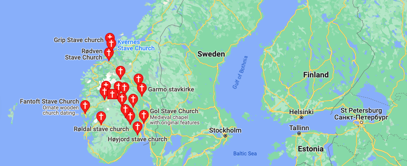
I wrote a short script (attached below) that allows you to quickly compare the distribution of ethnicities associated with a given ethnicity. Out of curiosity, I applied it to Norwegians and Swedes, and as I noted in, A New Model of Computational Genomics [1], they’re different people, that are of course nonetheless closely related. However, Norwegians are much closer to the people of the Pacific, specifically, the Thai. This is obvious when you look at Stave Churches, which are almost identical in structure and aesthetic to Thai temples, and moreover, don’t look anything like a normal church. On the left is a Norwegian Stave Church, and on the right, is a Thai temple, both courtesy of Wikipedia.
In fact, it turns out the distribution of Stave Churches is concentrated almost exclusively in Norway, at least according to Google. There are others elsewhere in Europe, but it seems the Stave Churches in Scandinavia are generally limited to Norway. The map below is obviously courtesy of Google, and you can generate it yourself by simply typing in, “Stave Churches near Scandinavia”.
If you actually compare the distribution of associated ethnicities between Norwegians and Swedes, you get the chart below, which plainly shows that the Norwegians are much closer to the people of the Pacific, indigenous peoples generally, and some Africans. Specifically, TH stands for Thai (obviously in the Pacific), SI stands for the Solomon Islands (islands in the Pacific), SQ stands for the Saqqaq (indigenous people of Greenland), SM stands for Sami (indigenous peoples of Scandinavia and Russia), NG stands stands for Nigeria, and KH stands for Khoisan (a people in Southern Africa). The complete list of acronyms can be found at the end of [1]. The chart below shows a normalized rank for the Norwegians (i.e., a scale from 0 to 1), minus that same rank for the Swedes. This causes the values to range from 1 to -1. The rank for a given column is the normalized number of matches at 90% of a given genome, and all genomes are complete mtDNA genomes taken from the NIH database. That is, the algorithm first counts the number of Norwegians that are e.g., a 90% match to the Nigerians, and then normalizes that number from 0 to 1, with 0 being none of them, 1 being all of them. Then, that same data is produced for the Swedes, and the chart below shows the difference between the two. Informally, this is Norway minus Sweden, and so, e.g., column 1 shows that the Swedes are closer to the Kazakhs than the Norwegians (note that KZ stands for Kazakh), since it is a negative number.
All of the genomes in the dataset can be found in [1], and come from the NIH Database. Moreover, all of the genomes have been diligenced to ensure that the ethnicity classifier is in fact the ethnicity of the person in question. So e.g., if a genome is classified as Norwegian in my dataset, then the notes associated with the genome either explicitly state that the person is Norwegian, or plainly indicate that the person is Norwegian (as opposed to a Swede living in Norway). The dataset contains a link to the NIH Database for every genome, where you can review the notes yourself.
Here’s the code, whereas the dataset (and any missing code), is linked to in [1].
I’ve noted many times that some Finns and Ashkenazi Jews are very closely related to Denisovans, with about 70% of their mtDNA genomes matching to Denisovans. See A New Model of Computational Genomics [1], generally. I’ve also noted that the Iberian Roma and Papuans are even closer to Heidelbergensis, with about 95% of their mtDNA genomes matching Heidelbergensis. I occasionally chip away at this work in my free time, and so I tested Sephardic mtDNA tonight, honestly expecting to find something different from Ashkenazi Jews, given that they really are different people, with different histories. It turns out, instead, that the three Sephardic genomes I found on the NIH website were also related to Denisovans, though they are however closer to the Munda people of India than Ashkenazis. This is surprising but not impossible, it just means that Jews really are a genetically distinct group of people, despite being a diaspora.
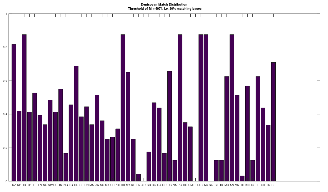
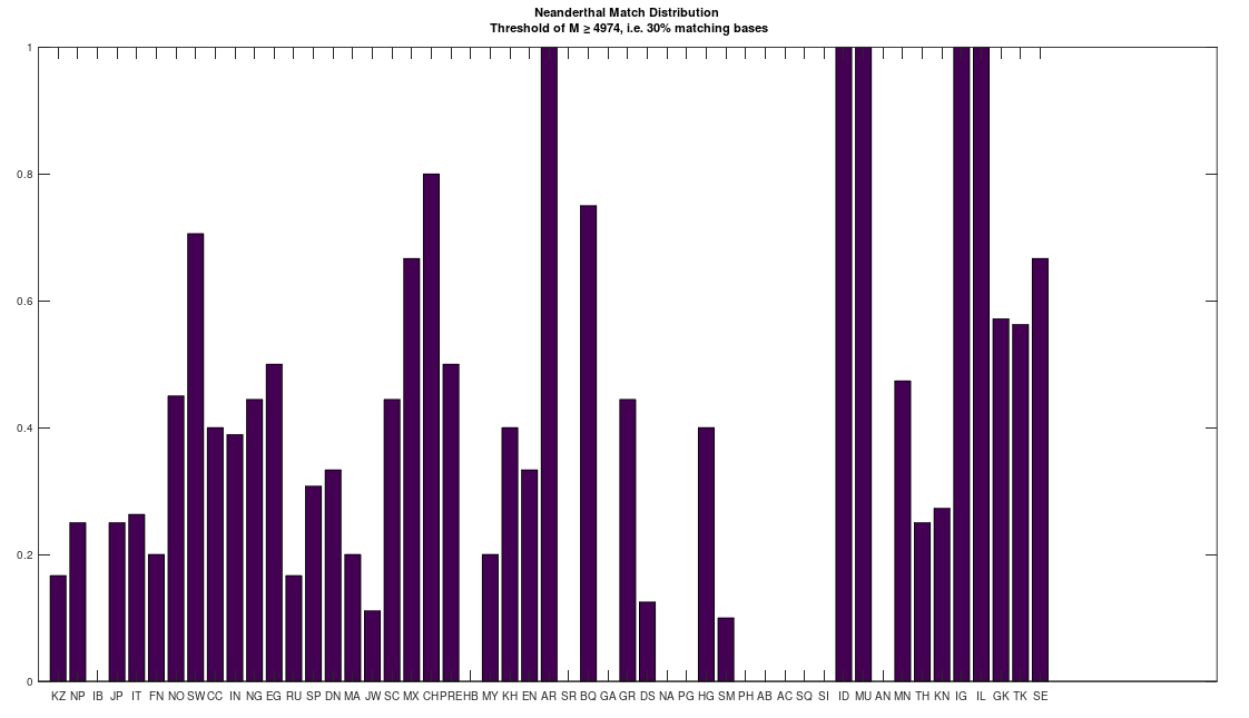
However, this got me thinking, that perhaps many people descend from Denisovans, since I was totally unable to find an archaic species that had an analogous relationship to the bulk of the dataset. That is, the Roma and Papuans (and many others scattered about the world) are extremely close to Heidelbergensis, suggesting they descend from Heidelbergensis. Similarly, some Finns and Ashkenazi and Sephardic Jews (and some others, again scattered about the world) are closely related to Denisovans, suggesting they descend from Denisovans. Many people are also a 95% match to Neanderthals, and they seem to be roughly the same group of ethnicities that are close to Heidelbergensis. The obvious question is, where do the rest of us come from?
To test this, I lowered the minimum match count to 30% of the genome, and compared the full dataset of genomes to Denisovans, Heidelbergensis, and Neanderthals. The results are plotted below, where the x-axis shows the acronym of the population in question, and the y-axis shows a normalized count of matching genomes, where a given genome constitutes a match if it has at least 30% in common with the applicable archaic genomes. The table of acronyms can be found at the end of [1], and there are links to the dataset I used in [1] as well. All genomes are complete mtDNA genomes taken from the NIH website.
There is at least one Neanderthal genome that has no connection to Heidelbergensis at all. In contrast, the Denisovans are related to both the Neanderthals and Heidelbergensis. This implies that the Denisovans are the common ancestor of both Heidelbergensis and at least that particular Neanderthal. See Section 6.1 of [1]. As a consequence, it seems we all descend from Denisovans. Also, out of curiosity, I lowered the match threshold for the Ancient Romans as well, since I’ve been otherwise unable to find a match, and it seems they have basically the same distribution as the Basque, Igbo, Munda, and Northern Europeans, all of whom are closely related, despite being totally different people.
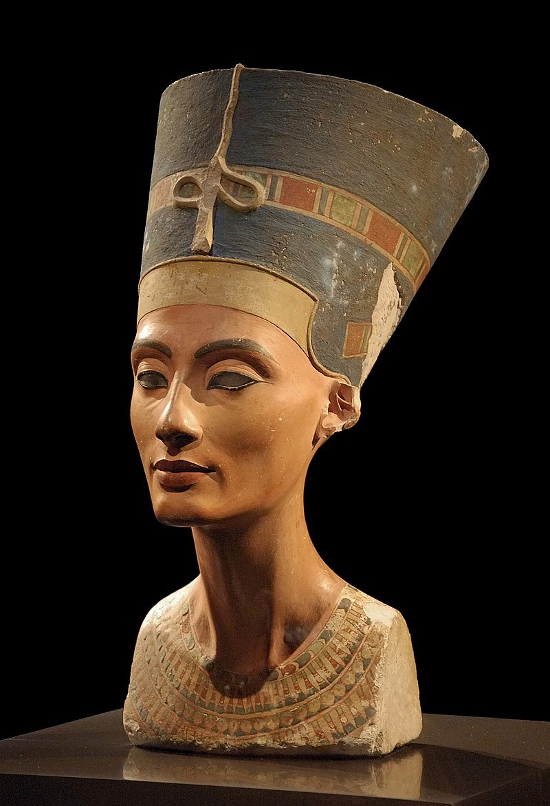
The Ancient Egyptians were plainly wiped out, given that their appearance changed drastically over a very short period of time, and this is actually reflected in their genetics as well, with Pre-Roman Egyptians a distinct genetic group from Egypt during the time of Rome. These things of course do happen in history, but the shift is drastic, from what are plainly Asian people (genetically and morphologically) to European people. That’s just not normal, and there’s no history to my knowledge that explains it. On the left is Menkaure and Queen Khamerernebty II (c. 2,530 BCE), courtesy of MFA Boston, in the center is Nefertiti (c. 1,370 BCE), courtesy of Wikipedia, and on the right is Cleopatra (c. 50 BC), courtesy of Wikipedia, who plainly looks nothing like the rest of them.
Moreover, there are literally no living people that are a 90% match to the Ancient Romans. This is simply impossible, without deliberate genocide, as plenty of people are a 99% match to a far older Ancient Egyptian genome, and plenty of other ancient peoples. Keep in mind, Rome was an enormous empire at its heights, far larger than Ancient Egypt. The logical conclusion, is that the Ancient Egyptians and Ancient Romans were related people, and both were subjected to comprehensive genocide.
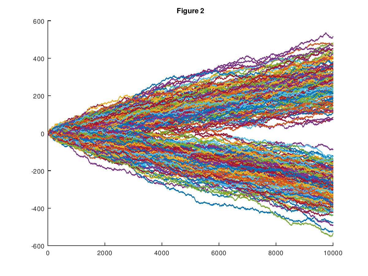
In my first formal paper on Machine Learning [1], I introduced a dataset of random walks, which now consists of 600 paths, each comprised of 1,000 observations. See Vectorized Deep Learning [2] and Analyzing Dataset Consistency [3], for an updated, and truly formal treatment of the methods introduced in [1]. Every path in the dataset is either upward trending, or downward trending, in that the probability of the path increasing in y-value from a given point is either greater than .5, or less than .5, respectively, producing two distinct classes of paths. The chart below shows the entire original dataset (which had a dimension of 10,000), plotted in the plane. I showed in [1] that my software can predict with good accuracy whether or not a given path will be upward trending or downward trending, given an initial segment of the path. This could itself be useful, however, it dawned on me that the underlying prediction methods imply a potentially new method of pricing assets.
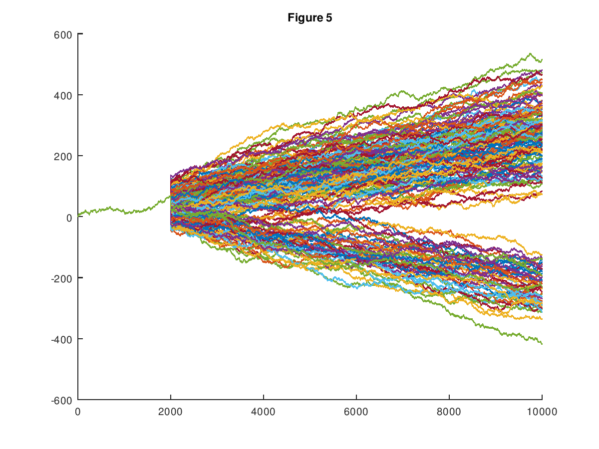
Specifically, the prediction algorithms introduced in [1], [2], and [3], build clusters associated with a given row of the dataset. In the case of the random walk dataset, this causes every path to be associated with a set of paths, that are sufficiently similar. Treating the y-value of the path as the price of some asset, we can then view the cluster of paths associated with a given initial path segment as possible paths that will be taken, as the given initial segment unfolds. Less formally, if you are, e.g., presented with the first 300 observations of a given path, which leaves 700 subsequent observations (since the total dimension is 1,000), the cluster generated from the initial 300 observations could be interpreted as the set of possible values for the remaining 700 observations. This is expressed in the chart below, which shows the cluster associated with the initial segment of a given path.
Discounted cashflows allow you to price an asset based upon its cashflows, and assuming you have the right interest rates, it’s basically impossible to argue that this will produce an incorrect price. However, market prices plainly deviate from theoretical prices, and as a consequence, the objective price of an asset is not the market price, which is instead its disposition value at a given moment in time. Moreover, not all assets have cashflows beyond disposition (e.g., a painting), and as a consequence, we cannot price such an asset using cashflows. However, you can price such an asset using the set of price paths over time. Specifically, from the present, given some information about present conditions, and the asset in question, we can then retrieve a cluster of possible price paths (based upon prior observations) for the asset in question. The simple average over that set of paths at any moment in time gives you the price that will minimize expected error, which is arguably the correct expected disposition value of the asset. This is very simple, but very difficult to argue with, and could therefore produce accurate prices very quickly, for otherwise difficult to price assets. For example, imagine pricing a structured note using this method. Ordinarily, you would have to first model the underlying assets, then account for the waterfall, and finally that would produce a price. In contrast, this method allows you to use Machine Learning to pull a cluster of similar assets, and simply take the average at the time of planned disposition.
The real magic is of course in the production of the cluster, specifically, ensuring that the paths produced are generated from sufficiently similar assets. My software Black Tree AutoML as a general matter produces accurate, and meaningful clusters, plainly suggesting that it can be used to price assets, in addition to everything else it does. Note that because this method uses a distribution to predict a single outcome, you will have to repeat this process over time to achieve the average, which can be done using a portfolio of trades, rather than a single trade.
Applying this to options, consider a Bermuda call option that is exercisable on exactly one date, and fix a strike price. Now pull the cluster of possible price paths for the underlying security. We then look at the set of possible prices on the exercise date, take each such price from the price paths on that date, subtract the strike price from each, and if the amount is negative, set it zero (i.e., the option is worth zero if the market price is below the strike price). Take the average over that set of prices, discount it to the present, and that’s the option premium from the perspective of the option buyer. For the option writer, you set any price below the strike price to the premium, and then solve for the premium using the same average. This creates an asymmetry and therefore a bargaining range, which could at times be empty.
This is (to my knowledge) a completely new method of pricing options, that’s obviously correct. However, it’s at odds with intuition, since volatility doesn’t matter at all, and it is instead only the average over the curve at a moment in time that’s relevant to the premium. This is because the method uses a distribution of outcomes, effectively assuming the same trade is effectuated many times over different possible paths. This can be simulated as a practical matter by buying or selling different yet similar securities, thereby effectuating many trades, and if they’re sufficient in number, you should get close to the average. If there’s any difference between the premiums charged in the markets, and your theoretical premiums, you’ll make money.
However, volatility is relevant to uncertainty, in the literal sense that multiplicity of outcome creates measurable uncertainty. See Information, Knowledge, and Uncertainty [4], generally. As a consequence, when deciding between two options that have the same expected returns on their premiums (as calculated above), you will select the one with lower volatility. Therefore, volatility should reduce the premium. I think it is going to be a function of the number of outcomes necessary to achieve a given expected tolerance around the average. For example, tossing a coin should converge to the uniform distribution faster than tossing a six sided dice. Similarly, an asset class with a wide range of possibilities (i.e., high volatility) should require a larger number of trades than an asset class with a narrow range of possibilities (i.e., low volatility), if the goal is to achieve the average. As a general matter, if the outcome space is real-valued, then the standard deviation should provide information about the rate of convergence, and if instead the outcome space is discrete (e.g., a coin toss), then the entropy should provide information about the rate of convergence. In both cases, the slower the rate of convergence, the greater the discount to the premium, for the simple reason that you have a wider range of outcomes, which again produces measurable uncertainty, and therefore requires a bigger portfolio.
This could be implemented as a practical matter by taking a Monte Carlo sample over the cluster of paths. So e.g., if the cluster contains 100 paths, you would randomly sample 10 out of the 100 paths, some large number of times, which will produce a set of averages, which will be indicative of your outcome space with 10 trades. You could then increase the number of trades, until the distribution looks good from a risk perspective. If that requires too many trades, then you don’t execute on the strategy. It turns out it’s really easy to test whether or not two variables are drawn from the same distribution, using normalization, since they’ll have the same average. This is important, because what you want in this case is a set of assets that are all drawn from sufficiently similar distributions, allowing you to simulate repeated trials of a single random variable.
Note that in this view, increased volatility should reduce liquidity, which is at least anecdotally consistent with how markets really work. Specifically, in the case of options, as volatility increases, uncertainty increases, which will cause a seller to increase the spread over the premium (as calculated above), for the simple reason that the seller is assuming greater risk, in order to achieve the minimum number of trades required to bring the uncertainty to a manageable level. That is, in order to get sufficiently close to the average, the actual dollar value of the portfolio has to be larger, as volatility increases. At a certain point, as volatility increases, both sellers and buyers will lose interest in the trade, because there’s only so much demand for a particular trading strategy. The net conclusion being, this way of thinking is perfectly consistent with the idea that increased volatility reduces liquidity, since both sellers and buyers will need to put up more capital to manage the risk of the trade.
To actually calculate the total premium, I think the only relevant factor in addition to the average considered above, is the cost of financing the portfolio of trades associated with a given trade. For example, assume a market maker M has two products, A and B, and because of volatility, 30% of M’s funds is allocated to trades related to product A, and 70% is allocated to trades related to product B. That is, B is a higher volatility product, and so more trades are required to produce a portfolio that is within some tolerance of the average discussed above. The fair premium for both A and B would simply be the premium calculated above, plus a pro rata portion of the applicable costs of financing the relevant portfolio. For example, if someone put on a trade in product A, equal to 1% of the total outstanding principle for product A, they would be charged the premium (as calculated above), plus 1% of the cost of funds associated with the portfolio for product A. This can of course be discounted to a present value, producing a total premium, that should be acceptable to the seller (subject to a transaction fee, obviously). I’m fairly confident this is not how people think about financing trades and calculating prices, but it’s nonetheless plainly correct, provided you get the Machine Learning step right.
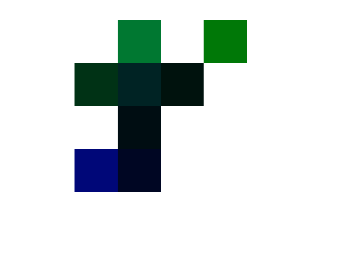
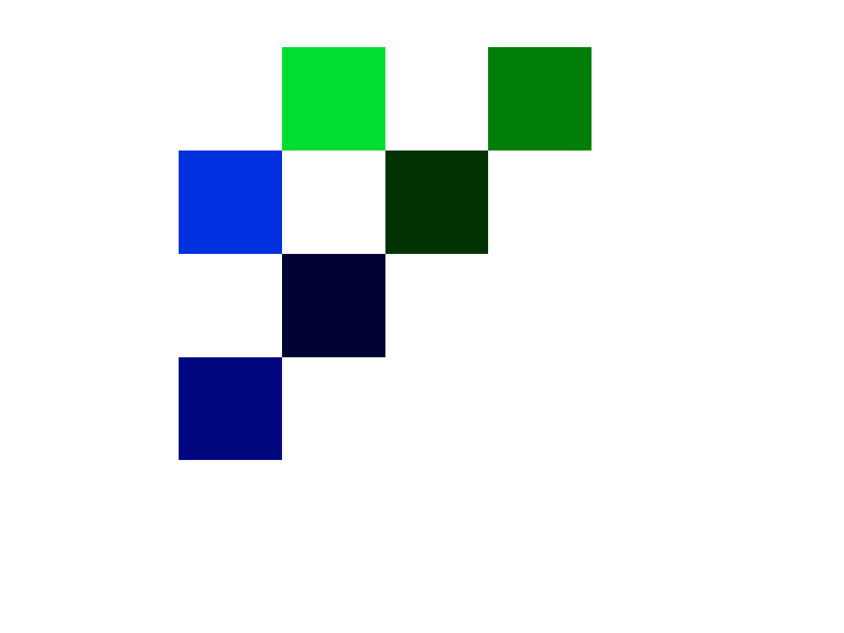
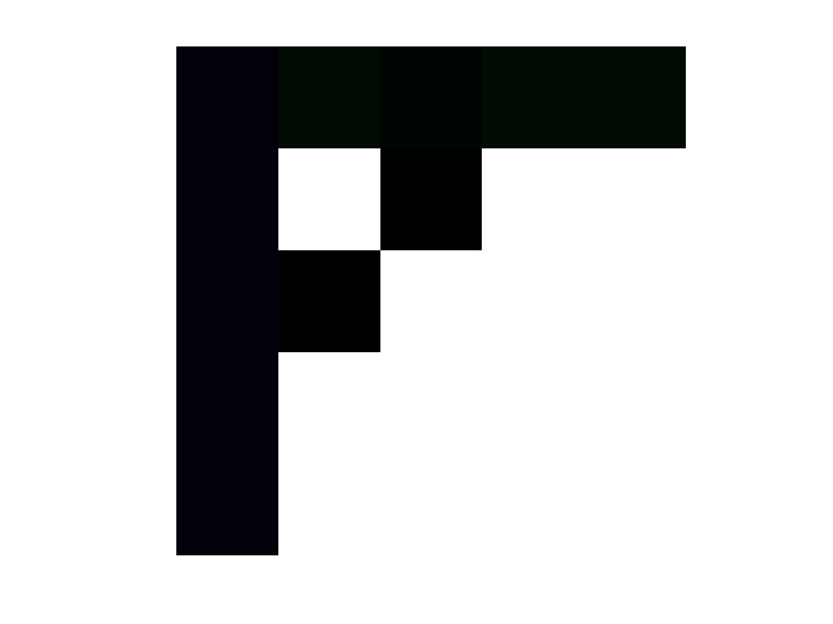
I wrote a note a while back about shapes produced by Diophantine equations. Specifically, consider an RGB image as a matrix of color luminosities. This is actually how images are typically stored, as a collection of 3 matrixes, where the entry of a given matrix represents the luminosity of one of the three color channels (i.e., red, green, or blue). These are typically integer values from to , corresponding to no luminosity and maximum luminosity, respectively. If all three channels are at a given entry, then the corresponding pixel is black. If all three channels are at a given entry, then the corresponding pixel is white.
The idea I had was to impose a diophantine equation on an RGB matrix set, and see if any matrices actually satisfied it, and it turns out, they do, and the resultant images are aesthetically interesting. You can see a few plotted below, and these correspond to solutions to the equation,
,
Where and are indexes in the three matrices, and B and G are the actual pixel values at those indexes in the blue and green channel matrices, respectively, and is some positive integer. As you can tell, this particular equation disregards the red channel, simply because the color palette I wanted was blue, green, black, and white. Applying this as a practical matter requires a Monte Carlo method to find solutions, and this code does exactly that. This is how I generated the logo for my software, Black Tree AutoML.
In the examples below, all of the the pixels satisfy the equation above. Specifically, each image has a fixed value of , and for a given pixel in a given image, in position , the luminosity for the blue and green channels sum to , when raised to the powers and , respectively. All of the the images below are matrices, with the red channel set to . If there’s no solution for a given , in an image that contains solutions elsewhere, pixel is set to white. There are at times many solutions for a given value of , and the attached code uses the first one found by the Monte Carlo method.
Earlier today, I happened to have turned to a random page in my notes from around the same time I was working on this equation, and I noted only half in jest, that this suggests a more general idea, that could, e.g., imply an equation for pizza. This sounds insane, but it’s obviously not, because the more general idea is a Diophantine equation imposed upon a set of matrices, that in turn produce a representation of a real world object. Intuitively, you would say fine, perhaps, provided that the density of solutions that correspond to real world objects is low. However, looking at the images above, you can plainly see the shapes are symmetrical, and even aesthetically pleasing. This in turn suggests that the density of reasonable representations of real world objects might be more dense than random, and perhaps even meaningfully dense, simply because this particular equation seems to produce fairly sophisticated symmetries.
Though the inspiration was partly motivated by humor (i.e., the equation for pizza), the reality is, this could be a very serious idea, that would allow for the characterization of systems, possibly dynamic systems, using Diophantine equations. This is not how physics, or anything for that matter, is done, but it might work. My intuition is that it will work, and that continuous representations of systems made sense centuries ago, simply because we didn’t have computers capable of solving complex discrete equations, like the one above. Moreover, it is now widely accepted that certain phenomena of Nature are quantized (e.g., electrostatic charge, electron orbitals, and quantum spin), which in turn suggests that this might be how reality is actually organized. If that’s true, it’s not clear to me what continuous mathematics represents, and it really shouldn’t be, because we’re capable only of finite observation. As such, every physically meaningful representation will be informed by a discrete set of observations, even if those observations are used to generate a continuous function. In fact, I developed an entirely new model of physics that makes no use of calculus, and implies all the right equations of physics, including those produced by relativity. This is really puzzling, because Newtonian physics is accurate, yet predicated upon calculus. There should therefore be disconnects, where continuous integration fails, producing an incorrect equation, and the place to look in my model relates to the distribution of kinetic energy in a system (See Section 3.3 of the last link).
There’s also the question of computability, since not all Diophantine equations are computable, and this was shown in response to Hilbert’s Tenth Problem. Therefore, it must be the case, that the set of constraints includes problems that cannot be expressed as solutions to equations solvable by deterministic algorithms. Taking this to its extreme, you could at least posit the possibility that reality itself is the product of such a constraint equation, that restricts possibility, in turn implying physics, as a logical corollary of something even more fundamental. That is, physics would be in this view an approximation of a more fundamental restriction on possibility, given by perhaps a single master equation. If this is true, then it follows that reality could be non-computable, and there is at least some academic work that has found non-computability in existing physics. My personal conjecture is that reality is not Turing-Computable, only some of it is, and this follows from the observation that some people have minds that are plainly superior to machines.
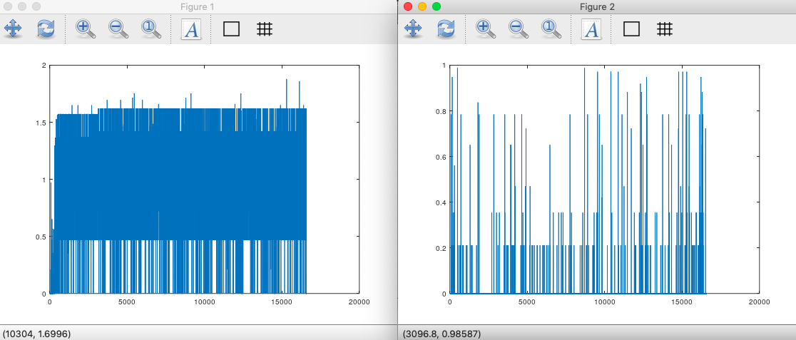
The Papuans and Iberian Roma are nearly identical on the maternal line, as measured by mtDNA. See, A New Model of Computational Genomics [1], generally. However, they have different distributions, in that if you plot the entropy of the distribution of bases at a given index in the mtDNA genome, you’ll see they produce very different graphs, with different measurable characteristics. See the charts below, with the Papuans on the left, and the Roma on the right. As a consequence, despite the fact they are plainly very closely related people on the maternal line, they must have different distributions of those same genomes. For example, posit two populations A and B. Both populations have genome X, however in population A, genome X appears 10 times, and in population B, genome X appears 4 times. As a consequence, despite the fact that both populations intersect, in that they both have at least some instances genome X, they nonetheless have different distributions of that genome, since X appears more in A than in B.
If selection is functioning well in a given population, then the distribution of genomes should eventually converge to whatever the ideal distribution is, for the environment, within the powers and perceptions of the individuals in the population (e.g., not all species will be able to identify ideal mates). As a consequence, you should be able to start out with any number of each possible genome type, and nonetheless converge to the ideal distribution of genomes, simply through selection over time. Specifically, posit a set of genomes , where obviously changes as a function of time , and each gives the integer count of the number of genomes of type , at time . This would imply that as increases, selection will cause to converge to the ideal distribution of genomes, since the undesirable genomes will either be reduced in count over time, or die off completely. In contrast, the desirable genomes will of course flourish.
Returning to the Papuans, how is it that they have a different distribution of maternal lines, if those individual maternal lines are in fact so similar? One sensible answer is exactly this mechanic, which causes the distribution of maternal lines to reflect environmental factors, in particular paternal selection. Since the Iberian Roma live in Spain, and the Papuans live in Papua, they of course could have differing ideal distributions of mtDNA genomes. Ultimately, left to itself, a population of women will be selected by men for reproduction, and vice versa, suggesting that there’s a difference in preferences between the Iberian Roma men and the Papuan men, since the women are nearly genetically identical, as measured by mtDNA. This is obviously plausible, given that they’re very different people, at least superficially and geographically. The astonishing fact is that they are so genetically similar, despite this, leading to many of my ideas in genetics generally, in particular, the disconnect between genetics and appearance, when compared to genetics and brain power. Selection is therefore yet another explanation for how it is that mtDNA carries information about the paternal line, despite being inherited directly from the mother with little to no mutation.
I introduced an algorithm that can predict ethnicity using mtDNA alone, with an accuracy of about 80%. See Section 5 of A New Model of Computational Genomics [1]. This is already really impressive, because mtDNA is inherited strictly from the mother, with basically no changes from one generation to the next. So how could it be that you can predict ethnicity, using mtDNA alone, since ethnicity is the product of both maternal and paternal lineage? I have some ideas, and you can see [1] generally for a discussion. However, I realized that I was accidentally providing information about the testing dataset into the training dataset, which is obviously not good practice in Machine Learning. I corrected this oversight, and the accuracy consistently increased, from about 80%, to about 85%. This might seem small, but it’s significant, and it’s consistent, suggesting that the process of removing information about the testing dataset from the training dataset actually improved accuracy. I’m not wasting my time figuring out the specifics of what happened, but it is worth noting, that in the abstract, this is an instance of an algorithm that is better at predicting exogenous data, than endogenous data. This is really strange, and counterintuitive, because it simply must be the case that including a given row actually harms predictions about that row, and improves predictions about other rows. Said otherwise, rows contribute positively to predictions about other rows, and negatively to predictions about themselves. To make the math work, it must be the case that the net contribution of a given row is positive to the predictive power of the algorithm overall, but this does not preclude the possibility a given row subtracting from the accuracy of predictions about itself.
As a general matter, it suggests a framework where each observation contributes information to a model, and that information relates to either the observation itself, or some other observations. And this would be an instance of the case where each observation carries negative information about itself, and positive information about other observations. Upon reflection, this is what mtDNA must do: it must provide information about paternal genes, which are most certainly not contained in mtDNA. That is, mtDNA carries information about an exogenous set of observations, specifically, where the father’s line is from. Similarly, each genome carries information about the other genomes, and its inclusion somehow damages predictions about itself.
This is counterintuitive, until you accept the abstract idea that an observation conveys information, and then there’s a secondary question about whether that information relates to the observation itself, or some other observations. Statements can of course be self-referential, or not, since, e.g., I can tell you that, “John is wearing a rain coat, and I am simply carrying an umbrella.” That statement conveys information about John and myself, and so it provides exogenous and endogenous information. What’s counterintuitive in the case of this genetics algorithm, is that viewing the observation as a statement, it provides reliable exogenous information, and noise as endogenous information, thereby contributing positively to a whole, yet subtracting from the knowledge already stored about itself. This is consistent with the fact that the Nearest Neighbor algorithm performs terribly, compared to the method I introduce in Section 5 of [1]. See Section 3 of [1], where accuracy is around 39%. Specifically, this seems to be the result of the fact that each row contributes negative information about itself, and though the Nearest Neighbor algorithm relies somewhat upon context, since I can e.g., insert a new row which could change the nearest neighbors, the prediction is ultimately of course limited to a single row. In contrast, the method introduced in Section 5 of [1] first processes the dataset, producing a new dataset, based upon averages taken over the entire dataset. As a consequence, each row directly contributes to a new whole, whereas in the Nearest Neighbor method, there is no new product based upon the whole.
Applied physically, you arrive at something like Quantum Entanglement, coupled with Quantum Uncertainty. Specifically, making an observation would in this case reduce your knowledge about the system you’re observing, thereby increasing your uncertainty, and at the same time, providing information about some exogenous, and presumably entangled system. All of this suggests at least the possibility of some fundamental accounting of the sort presented in, Information, Knowledge, and Uncertainty [2]. Specifically, it seems at least possible that the less information a given observation conveys about itself, the more it conveys about some other system. If this is physically true, then the consequences would be astonishing, in that measurement of X, literally destroys information about X, yet reveals information about Y. This could cause e.g., systems to actually vanish from observation, and thereby reveal others. Applying this to Quantum Entanglement, measurement of one entangled particle causes the other entangled particle to change, because of exactly this accounting: that is, the second particle changes, to destroy the information had prior to the measurement of the first particle, thereby preserving a zero-sum accounting. If the particles happen to have a mathematical relationship, then you might still know the state of both, through the change made to one. The point being, however, this theory implies the possibility of a change to one entangled particle causing the other to change to an unknown state. So it’s not concerned with your subjective knowledge, and instead, the mechanic involved is one that relates to the destruction of information.
Obviously, this is abstract, and not supported by this limited example, but this type of expanded Ramsey Theory, that I’m starting to think of as the physical meaning of mathematics, has in my experience practical physical meaning. Specifically, [2] is a very serious paper that allowed me to write A.I. software that runs so much faster than anything I’ve heard of before, that I’m not sure anything else is useful.
It must be the case that mtDNA carries information about paternal lineage, since you can predict ethnicity using mtDNA alone, with an accuracy of about 80%. See, A New Model of Computational Genomics [1], generally. Chance, at least with respect to the dataset in [1], implies an accuracy of about 3%, since there are 36 ethnicities in that dataset. There’s a question of how this could be, since mtDNA is inherited directly from the mother, with very little, possibly no variation from one generation to the next. I posited that the mechanics of DNA replication are at least partially inhereted from the paternal, which would cause similar rates of mutations in mtDNA in people that have the same paternal line, despite the fact that mtDNA is inhereted directly from the mother. For example, just assume arguendo, the ribosome is inherited from the paternal line. It follows that the probability of an error during replication is determined by the paternal line. Specifically, it should be the case that the probability of an error during replication is roughly constant over the entire genome. As a consequence, if a single paternal line exists in a population, the entropy of the distribution of bases along the entire genome should be roughly. Moreover, a less sophisticated argument is that it’s simply male selection that alters the distribution of otherwise highly similar maternal lines. That is, you two take identical instances of the same maternal line, introduce them to two different paternal lines, selection alone could produce variation, which should show up in the charts below.
This is in fact the case for at least some homogenous populations, in particular, the Iberian Roma and Papuans. These two populations are a 99% match on the maternal line (See [1] generally), despite the fact they look completely different, and one lives in Spain, and the other lives in Papua. This suggests that they should have different paternal lines. If my hypothesis is correct, then the entropy of the distribution of bases along the genome should be different, and they are. See below, with the Papuan entropy plotted on the left, and the Iberian Roma entropy plotted on the right. The calculation is straightforward: each index along the genome will constitute a distribution of bases over the population, which will therefore have an entropy. The entropy at each index along the genome is plotted below. If the paternal line is uniform, then the probability of mutation should be uniform at each index, creating a uniform value of entropy along the genome. If the probability of error is low, then the entropy should be low. As you can see, the Roma (on the right), are not only more homogenous in the distribution of entropy, they also have a lower entropy overall. This suggests a lower rate of mutation over time, and a homogenous distribution of paternal lines, since if there were many paternal lines, the variance of the entropy should be high, and it is instead low. That is, if you have many paternal lines, then you don’t have a single distribution of mutation at each index, since you have many overlapping distributions, which should cause variance in the entropy over the entire genome. Therefore, the average entropy over the genome is indicative of the rate of mutation in the population, and the standard deviation of the entropy over the genome is indicative of the number of paternal lines. Note that because both the Roma and Papuans are basically identical on the maternal line, the fact that the distribution of entropy is so drastically different between the populations, is itself evidence for the claim that the paternal line impacts the replication of mtDNA.
This is in contrast to a more heterogenous population, like the Norwegians. In this case, not only is the implied rate of mutation higher, the variance of the entropy is also higher. This in turn implies that the Norwegians have a more heterogenous set of paternal lines than the Roma and Papuans, which makes perfect sense, since they also have a more heterogenous set of maternal lines. Here’s the same plot for the Norwegians, and as you can see, I’m right, as usual.
Here’s the code, any missing code and the dataset itself can be found in links in [1]:
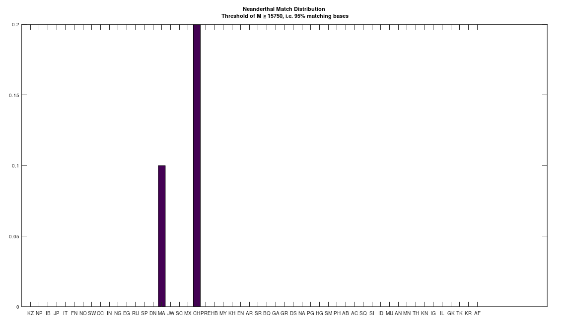
I initially lost interest in Neanderthal mtDNA, simply because I couldn’t find a meaningful match in any ancient or modern population. However, I just revisited the Neanderthal genome, out of curiosity, given that the dataset has now doubled in size since I started, and it turns out there are 95% matches to the Maritime Archaic and the Chachapoya. The Maritime Archaic match is already surprising, because they were in Canada. However the Maritime Archaic are from as early as 7,000 BC, so, it’s at least ancient. In contrast, the Chachapoya lived until 1470, and had contacts, and even mated with Europeans. The match percentage in both cases is significant, with 10% of the Maritime Archaic and 20% of the Chachapoya, 95% matches to the Neanderthal genome. This plainly implies that Neanderthals lived well into what is fairly modern history. This of course in turn suggests the possibility of living Neanderthals, since I doubt anyone would notice, given that at this point, they’d be basically indistinguishable from us due to intermixing.
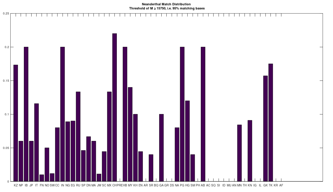
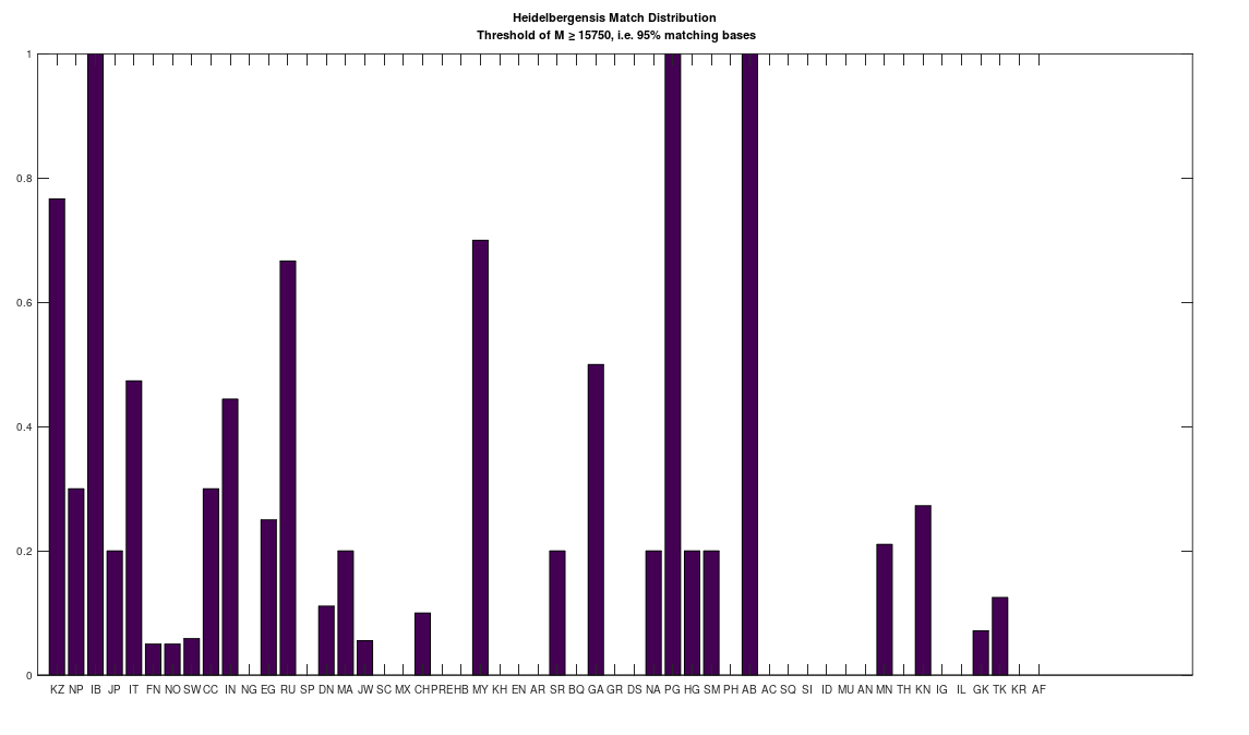
As a consequence, I decided to download a few more Neanderthal genomes, and there are a ton of them on the NIH Website. And as it turns out, there are plenty of people that are a 95% match to the Neanderthals (left), and these are the same populations that are a 95% match to Heidelbergensis (right), suggesting plainly a connection between Neanderthals and Heidelbergensis. If you’re interested, you can read my paper, A New Model of Computational Genomics for an explanation of the methods involved in producing these charts.


 entry of a given matrix represents the luminosity of one of the three color channels (i.e., red, green, or blue). These are typically integer values from
  to
to  , corresponding to no luminosity and maximum luminosity, respectively. If all three channels are
  ,
, and
and  are indexes in the three matrices, and B and G are the actual pixel values at those indexes in the blue and green channel matrices, respectively, and
  is some positive integer. As you can tell, this particular equation disregards the red channel, simply because the color palette I wanted was blue, green, black, and white. Applying this as a practical matter requires a Monte Carlo method to find solutions, and
  matrices, with the red channel set to


 , where
  obviously changes as a function of time
  , and each
  gives the integer count of the number of genomes of type
  to converge to the ideal distribution of genomes, since the undesirable genomes will either be reduced in count over time, or die off completely. In contrast, the desirable genomes will of course flourish.