Updated mtDNA Dataset

I’ve updated the dataset to account for ethnicity specifically, and so now all genomes have provenance directly tied to e.g., the Chinese, as opposed to simply being sampled in China, by a person that might not be Chinese. This applies to all of the 24 ethnicities, for a total of 341 complete mtDNA genomes. The overall number of rows increased, but some nationalities were reduced in size, because I wasn’t able to confirm ethnicity. The results really didn’t change much at all, so the last few articles I wrote still stand, but I’m still kicking the tires on all of this. That said, this dataset is now thoroughly diligenced, and again includes the raw genomes, together with links to the NIH Database for each genome included in the dataset.

One hypothesis I had that turned true, is that as you increase the number of rows, populations become increasingly concentrated in themselves. As a result, with a huge database like the NIH has, you can probably find a near perfect match for any two populations, but a truly perfect match seems to be limited in number for remote groups. As a consequence, working with a smaller dataset makes sense, if you want to uncover interesting relationships between populations. That said, running a BLAST search is a good sanity check for any hypothesis.

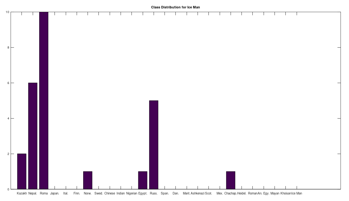
One shocker, I found a 4,000 year old, Pre-Roman Egyptian complete mtDNA genome, and its closest matches in the dataset below are a Norwegian and a Dane (graph above). I just proofed it using BLAST, and it seems like it’s legit, as a near perfect match comes up with an ethnic Norwegian. This is consistent with the last few posts I’ve shared, showing a strong genetic connection between the Nordic people (if you include the Scotts) and a global population that reaches all the way from South America to Polynesia, that seems to predate the Vikings. I would wager again, the world was globalized, a really long time ago, and it could have been the result of sailboats and possibly early telescopes, or something close that would allow you to spot land over huge distances, rather than meander at sea and therefore almost certainly die in places like Polynesia, where the distances between islands are way beyond human vision.

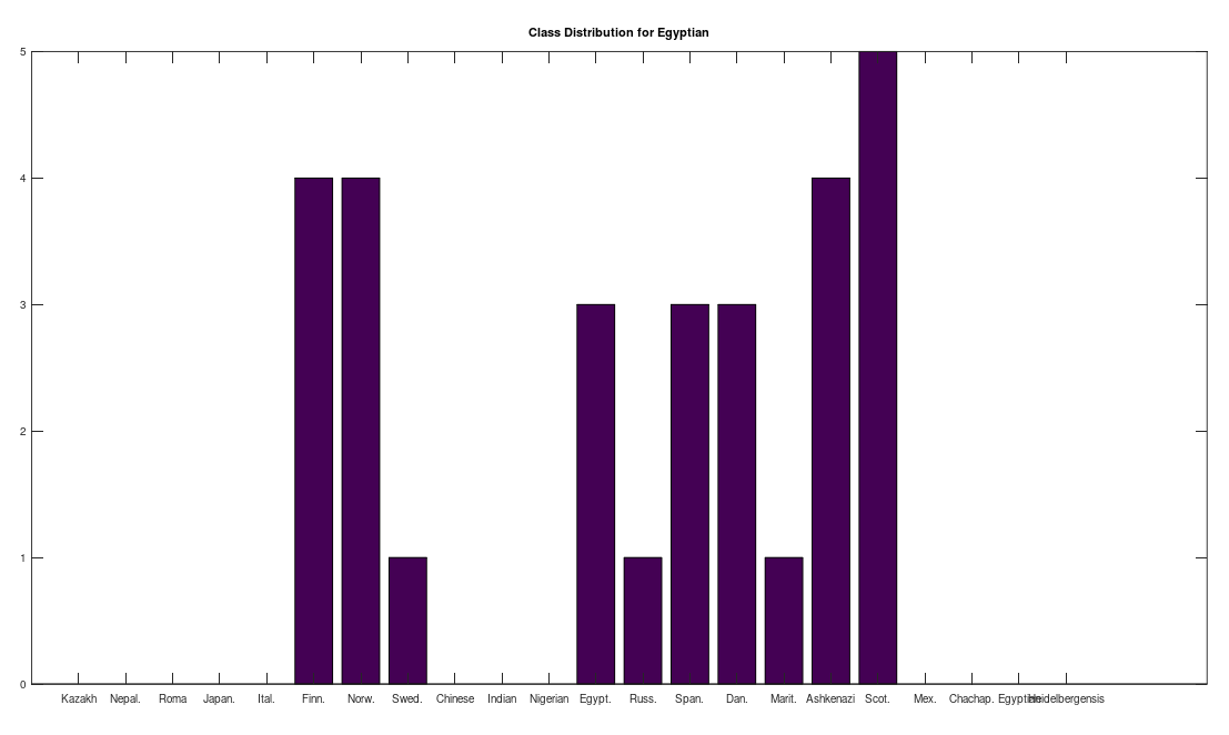
I tested it even further, and bizarrely, the Scotts yet again, show up as the dominant group for the 4,000 year old ancient Egyptian genome. Note again, this is a dataset of complete genomes, including two African countries (Nigeria and Egypt itself), and the Scotts are the dominant group when you set the minimum matching base count to 99.7% of the genome. This is not, to my knowledge, consistent with known history, and suggests yet again, the world was significantly globalized, a very long time ago. Interpreted literally, this means 5 out of the 20 Scottish genomes in the dataset were a 99.7% match to a 4,000 year old Egyptian genome.

The bottom line conclusion is that many Scottish people are plainly of Ancient Egyptian heritage on their maternal line. You can fuss that the number of genomes per population is not uniform, but this doesn’t change the percentage of Scotts that match, which is plainly high. Moreover, there are 20 modern Egyptian genomes and 20 Scottish genomes, and the Scotts plainly fit better. Further, there are 19, 20, and 18 Finnish, Norwegian, and Swedish genomes, respectively, and the Swedes are plainly not as closely related to the Ancient Egyptian genome, suggesting that it’s not a simple matter of geography. Finally, that any of the Northern Europeans are this closely related is simply baffling, since, e.g., why aren’t the Nigerians and Italians related? They’re geographically proximate, with some kind of sensible historical connection. This is irrefutable, and simply not consistent with known history.

Rather than give the Scotts any special credit, I think the takeaway is instead that the world was already diverse a very long time ago, and this is consistent with the distribution of aesthetics in the world before Christ, in particular in Ancient Egypt, which plainly depicts racially diverse people, though this is not true during Cleopatra’s reign, when people seemed more or less Mediterranean. On the left is the Berlin Green Head, in the center is Menkaure and Queen Khamerernebty II, and on the right is Nefertiti, images courtesy of Wikipedia, MFA Boston, and Wikipedia, respectively.


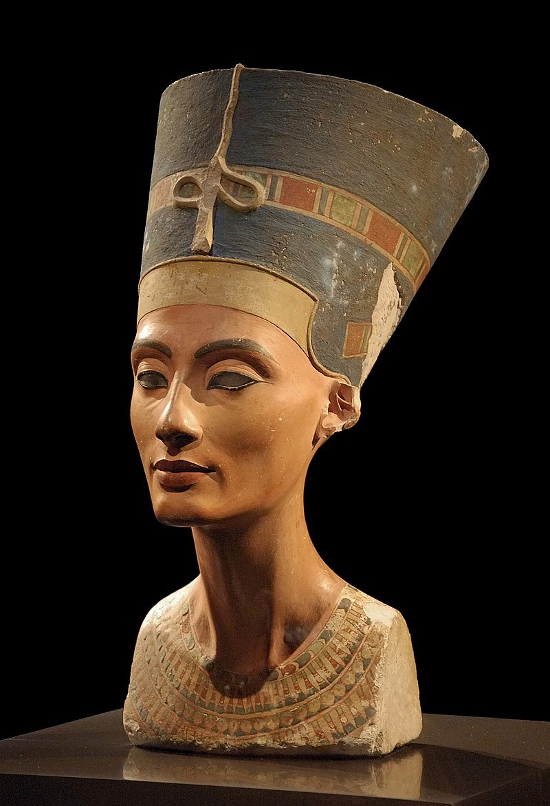
You’ll note that none of these people look Mediterranean, and in my opinion, they look to be of mixed heritage, demonstrating African, Asian, and European features. They could instead be so ancient that they are like the Khoisan, who have similar mixed features, but that is apparently not supported by the dataset, suggesting that they really were multi-racial people. When you look at the level of skill in their work, I have no trouble believing it, as they were plainly an advanced people, and it requires advanced people to produce multi-racial people, in particular, royalty. I doubt there are many living artists capable of producing works on this level, and regrettably, many people still struggle with simply getting along with superficially different people. The cruel justice of this work is that it’s all nonsense, and our histories have apparently been mixed up for quite a long time.

Here’s the dataset:

https://www.dropbox.com/s/xacd04xdu9u1o63/mtDNA.zip?dl=0

Surprising Genetic Relationships

I’m continuing to download new populations of genomes, and I’ve discovered a simply astonishing connection between the Scottish and the Hawaiians. The algorithm in question runs Nearest Neighbor repeatedly, just like the previous post from earlier today, until it visits the same row (i.e., genome) twice. The first astonishing connection is that the nearest neighbor of a Scottish person is a Hawaiian person, and the relationship is reciprocal. There is simply no sensible explanation for this, that is consistent with accepted history. You can say, this is just two genomes, but they’re both complete genomes, and the relationship is again reciprocal, meaning that given 29 global populations, a Scottish person and Hawaiian person are near perfect matches, mutually, with 98.87 % of their genomes in common. Also, note that these samples are based upon ethnicity, not location, and as a result, the people in question are actually Scottish and Hawaiian, respectively. The dataset below contains links to the NIH database for all Chinese genomes, and here’s the link to the Hawaiian genome, so you can inspect the files and see that this is indeed the case.

It’s tempting to dismiss this as an inexplicable fluke, but the Scotts also pop up in South America, specifically, they again have a mutual relationship to the Chachapoya of Peru. I think the sensible theory is that early Europeans made it to extremely remote locations that must have required boats. Moreover, the peopling of Polynesia in general must have required sophisticated seafaring skills, as you can’t by chance make it to a remote island, and instead, you must have known that it was there, suggesting the possibility of telescopes. This suggests that regardless of any early Europeans arriving in Polynesia, someone had the skills necessary to make the journey from Asia or somewhere else, to a series of extremely remote islands, that cannot credibly be done by chance, without planning, which is also consistent with the use of telescopes, given the obvious limitations of human vision.

Finally, there is a plain aesthetic connection between Nordic artwork and that of the Polynesians, and Asians generally, and the Scotts are genetically linked to Nordic peoples. This does not mean that Nordic people brought Asians to Polynesia, and I would wager instead, that the world was already significantly globalized due to sailing alone, creating bloodlines that last to this day. The image on the top left is the Sanctuary of Truth, Pattaya, Thailand, the image on the top center is a Stave Church in Borgund, Norway, the image on the right is a detail from yet another Stave Church in Urnes, Norway, and the image on the bottom is a detail from a Polynesian war canoe. The images are courtesy of Wikipedia, except for the second and fourth, which are courtesy of stavechurch.com, and Zemanek-Münster, respectively.

The second relationship is again a mutual nearest neighbor relationship between a complete modern Chinese genome and an Ancient Egyptian genome, with a match count that is again basically the entire genome. However, in this case, the Chinese genomes in the dataset below are not labelled by ethnicity, and instead simply state that the location is China, so I can’t be certain as to provenance. Instead, I’ll note that their art plainly depicts Asian-looking people, prior to the age of Rome, and after Rome, e.g., Cleopatra, plainly has Western features. This is the Ancient Egyptian genome from the NIH, simply run a BLAST search using the buttons on the top right.

Finally, I’ll note that the truly Ancient Egyptians (i.e., before Rome) seem to have the EDAR variants associated with straight hair, and have what appear to be proto European, African, and Asian features (see below). The Khoisan people of Africa have notably similar features, and I suspect this is not the result of chance. The Khoisan also share an extremely close genetic relationship to the Mayans, that of course, also built pyramids, again suggesting this is not the result of chance. Here’s an image of Menkaure and Queen Khamerernebty II, courtesy of MFA Boston.

Now compare this to Nefertiti (left) and Cleopatra (right), both courtesy of Wikipedia. You can plainly see that these are not only completely different morphologies, but completely different aesthetics, with the bust on the right typical of Roman and Greek sculptures, the bust on the left consistent with earlier Egyptian artifacts that seem to portray Asian peoples, in particular, using an aesthetic and materials that are arguably unique to the earlier Egyptians.

Here’s the dataset, with tons of code in the previous articles linked to above:

https://www.dropbox.com/s/xacd04xdu9u1o63/mtDNA.zip?dl=0

Heredity Graphs

I’ve written a set of Octave algorithms that ultimately display connections between individuals based upon their mtDNA. The underlying process begins with a genome, finds its nearest neighbor, and then finds the nearest neighbor of that nearest neighbor, and so on, until it goes in a loop (i.e., until that process produces the same genome twice). The resultant paths are stored in a graph matrix, and the code then automatically generates code written in SageMath that allows you to visualize the results (i.e., you just copy / paste the SageMath code from a file that is automatically generated by the algorithms). The results are fascinating, and consistent with accepted theories, yet they also shed light on possibly new genetic connections. Here’s an example of a graph, generated for the Ashkenazi population, together with a color key on the right (also auto-generated by the algorithms).

One obvious and surprising relationship is the apparent connection between Ashkenazi Jews and the Maritime Archaic people. You’ll note that the Maritime Archaic people are plainly self-related, just like the Ashkenazi Jews. When you plot the same graph for the Maritime Archaic (below), the Maritime Archaic rows in both graphs are also connected only to each other. Specifically, rows 151, 152, 155, and 157 are connected only to each other below. These are the same rows above connected to the Ashkenazi Jews. Most of the other Maritime Archaic rows, are not self-contained, and are instead connected to global populations, suggesting that just like the Ashkenazi Jews themselves, the Maritime Archaic people related to Ashkenazi Jews were also a tightly knit and homogenous population.

The vertex labels are the genome indexes (i.e., row numbers) in the dataset, and an edge from one vertex to another (directed) indicates that the sink vertex is the nearest neighbor of the source vertex. The color key for each population in the graph is again auto-generated, and is displayed on the right.

We can consolidate these graphs by class, causing e.g., all of the Maritime Archaic edges to be attached to a single vertex. This will show us the connections between populations, rather than individual genomes. This reveals some fascinating results, in particular, the Chachapoya people of Peru are connected to the Scottish, suggesting that the migrations to the New World started in the far West, and included many people along the way. The vertex labels on the left are the populations indexes, which don’t really have much meaning if you don’t look at the code, and so the color key on the right again provides the population names.

Below is the code and the dataset of genomes, which includes the raw genomes and links to the NIH Database files for each genome.

https://www.dropbox.com/s/xacd04xdu9u1o63/mtDNA.zip?dl=0

https://www.dropbox.com/s/yw13jt0n4ip3598/Genetic_Nearest_Neighbor_Single_Row.m?dl=0

https://www.dropbox.com/s/2p6yrgbbjnizq7u/Genetic_Chained_NN_CMNDLINE.m?dl=0

https://www.dropbox.com/s/f5voza7ak6il3zo/Chained_NN_ByClass_CMDNLINE.m?dl=0

A Theory of Genetic Imputation

In a previous note, I demonstrated that randomly selected bases are better at predicting the nearest neighbor of a given genome, than a contiguous sequence containing the same number of bases. That is, if you want to predict the nearest neighbor of a genome over a dataset, and you can use only M out of a total of N bases, you will produce better results if you randomly select the indexes of the bases, rather than use a contiguous sequence of bases of length M. This is counterintuitive, but it makes sense if the bases are not truly independent of one another. This is probably mechanically true, since protein production occurs in consecutive sequences of three bases. As a consequence, it makes sense to spread the selection of the M bases randomly over the entire length of the genome, thereby minimizing the intersection of the information provided by the bases, and therefore maximizing the union of the information provided by the bases. I also showed in the previous note that whether you use sequential contiguous bases, or randomly selected bases, the nearest neighbor of a given genome becomes more likely to be predicted as a function of the number of matching bases M.

There is still however the more general question of whether, given some genome A, and set of base indexes x, knowledge of the bases A(x) implies knowledge about the genome A generally, beyond the bases in x. If this is true, and genome B is the true nearest neighbor of A, then it should be the case that genomes A and B have matching bases outside of the base indexes in x. That is, if the bases in A(x) fix some other bases outside the indexes in x, then it should be the case that A and B have other bases in common in those regions (i.e., the base indexes not included in x). We can of course test this experimentally, and the attached code does so over a dataset of 206 complete human mtDNA genomes. In fact, the condition in the attached is much more stringent, and instead requires that the nearest neighbor of A(x), genome B(x) (i.e., the nearest neighbor of A when consideration is limited to indexes x) maximizes the number of matching bases outside x. That is, if there is any genome other than B that has more bases in common with A beyond x, then genome A is disregarded. If instead the condition is satisfied, a counter is incremented. This test is done for increasing values of M, where M is the size of x, plotted below, where the horizontal axis shows the value of M, and the vertical axis shows the number of rows that satisfy the condition. Note again that x is randomly selected, and not contiguous. 

The number of rows that satisfy the test condition as a function of the number of bases considered.

Note the while the number of rows that satisfy the test condition might seem small, the probabilities are given by the Binomial Distribution, where the number of trials is equal to the number of genomes in the dataset (206), the number of successful outcomes is given by the values along the y-axis, and the probability of success is \frac{1}{206}. All of this can be understood by noting that if this were the result of chance, then once the nearest neighbor of a given row is fixed, the row that maximizes the match count beyond a given x can be selected in 206 ways. Note that a single successful outcome has a probability of about 0.37, whereas 15 successful outcomes has a probability around 10^{-13}
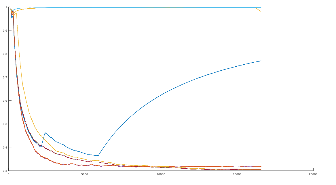
. As a consequence, it is not credible to claim that the graph above is the result of chance. Instead, it is more sensible to assume that imputation is a phenomenon justified beyond the existence of genes and haplogroups, and is instead a fundamental statistical property of genomes.

Finally, note that imputation is, mathematically, an abstract form of symmetry, where the part implies the whole, just as a set of points is projected over an axis of symmetry in the plane. The difference in this case is that DNA could be Kolmogorov random, and so the only inference available would be statistical, rather than structural. Specifically, that because B(x) is the nearest neighbor of A(x), they will with some probability have some number of bases in common outside x.

Below is the code for this analysis. The dataset and the underlying function code can be found in the previous post:

https://www.dropbox.com/s/58b923h1adq7z5v/Abstract%20Symmetry%20CMDNLINE.m?dl=0


Ancient mtDNA in the Americas

Introduction

I’ve been analyzing ancient mtDNA from the Americas using the techniques that I’ve started to truly formalize (see this note from earlier today), and it’s yielded some fascinating and unquestionable findings. Specifically, there were at least three distinct genetic groups that settled the Americas, with wildly different roots in Europe, Asia, and Africa. However, I’ll begin with a somewhat formal review to help with the epistemology, and intuition.

The methods I’ve been using are easy to understand, but require a bit of thinking and analysis to understand why they work. Specifically, what I’ve been doing is not that different from what the NIH’s BLAST Search does, which is to align two genomes, and then count the matching bases. However, I’ve been using a fixed alignment that is almost always used by the NIH anyway, since I want to account for insertions and deletions, whereas the NIH simply adjusts the alignment to maximize matching bases, often ignoring insertions and deletions, and simply disregarding the atypical portion of the genome. You can read about why I think this is the right method in this note, but the overall point is that insertions and deletions are associated with drastic changes in appearance and behaviors, e.g., in cases of Down Syndrome and Williams Syndrome. As a consequence, I will not ignore them, and instead, I search for the genomes have the same structure.

In mathematical terms, a genome is a vector of labels over the set \{A,C,G,T\}. As such, when comparing two genomes and counting matching bases, after adjusting alignment, we are engaging in a series of Bernoulli Trials. Therefore, the probability of generating K matching bases over two genomes of length N is given by the Binomial Distribution. One immediate observation after comparing any sizable number of genomes, is that mtDNA cannot be the product of chance. First note the sheer size of the outcome space, which is given by 4^N, where N is in this case 16,576 bases. This is a number that has approximately 10,000 digits, and cannot be calculated using an ordinary computer. The expected number of matching bases is \frac{1}{4} N = 4,144 bases. The standard deviation is \sqrt{N \frac{1}{4} \frac{3}{4}} = 55.74. Note that the expected number of matching bases, and the standard deviation have nothing to do with observation, and are instead implied by the fact that comparing N bases is a repeated series of Bernoulli Trials, each with a probability of \frac{1}{4}.

If you use the dataset attached, which consists of 205 compete human mtDNA genomes, you’ll find that taking the worst match between a given row and all others, and repeating this for each row, produces an average matching base count of about 4,500. This is about 6 standard deviations above the mean, implying that even the worst-case matches produce outcomes that cannot be credibly attributed to chance. In fact, the probabilities are so small they cannot be calculated in Octave using standard functions. Using the best-case matches (i.e., the Nearest Neighbor of each row), produces an average match count of about 16,000. This is about 213 standard deviations above the mean, plainly beyond the realm of chance. We can make sense of this by allowing for the possibility that DNA is Kolmogorov random (or close to it) in terms of its structure, yet rejecting the possibility that whether or not two genomes match is the result of chance, which is plainly not the case.

Moreover, in the note from earlier today, I showed that it doesn’t matter what portions of the genome you compare, provided that the portion compared is long enough. In fact, the results are almost always superior if the subset of the genome is randomly selected. That is, a random and possibly discontiguous sequence performs better than a contiguous sequence. This is initially counter-intuitive, since the standard method is to search for genes, and Haplogroups more generally. However, if you step back for a moment, consider being given only a fixed number of bases to analyze, which does occur because sequencing requires time, work, and money. If that limited number of indexes is randomly selected, and therefore randomly spaced, you will cover a wider portion of the genome, albeit incompletely. However, because the genome is plainly not the result of chance, the bases that are not selected are likely restricted in possibility by the bases that are selected, and as a consequence, randomly selecting some subset of bases performs better for at least some tasks. That said, obviously, the complete genome is the best performing option, so the point is instead one of epistemology, specifically, that because the genome is not random, selections constrain possibility, and as a consequence, it is at times better to cover a wider portion of the genome discontiguously, than a single contiguous sequence with the same total number of bases. Recall again, I’m not claiming that the initial construction of a genome isn’t Kolmogorov random, and I’m instead arguing that it is not the result of chance. As a consequence, given a set of genomes, the part determines the whole, and so partial information about a genome implies structure in the unobserved portion, which still allows for the overall structure to be Kolmogorov random (or close to it).

The above should provide a theoretical and practical intuition for the methods I’ve been making use of, which as you can tell, completely skip the step of identifying protein producing regions and instead focus entirely on what is common to two genomes, regardless of location or function. This is based upon the assumption that it doesn’t matter where you look in a genome, and instead the only thing that seems to matter (for at least some purposes) is the number of bases considered, and in this case, the number of matching bases between two genomes.

Application to Ancient Genomes

In applying these methods to Chachapoya (Peru), Mayan (Belize), and Maritime Archaic (Canada) genomes, I’ve found three distinct maternal lines. Note that all of the raw individual genomes are attached, including the assembled dataset, together with provenance files that contain links to the NIH Database for each genome. All of the genomes in the dataset are complete mtDNA genomes. The dataset includes 10 Chachapoya, 1 Mayan, and 10 Maritime Archaic genomes.  I compared each row of each of the three classes to every other row in the dataset, which consists of 205 complete genomes from the following 25 groups of genomes:

[1,1] = Kazakh
[1,2] = Nepalese
[1,3] = Iberian Roma
[1,4] = Japanese
[1,5] = Italian
[1,6] = Finnish
[1,7] = Norwegian
[1,8] = Swedish
[1,9] = Chinese
[1,10] = Indian
[1,11] = Nigerian
[1,12] = Egyptian
[1,13] = Russian
[1,14] = Spanish
[1,15] = Danish
[1,16] = Maritime Archaic
[1,17] = Ashkenazi Jewish
[1,18] = Scottish
[1,19] = Mexican
[1,20] = Ancient Peruvian (Chachapoya)
[1,21] = H. Heidelbergensis
[1,22] = Ancient Roman
[1,23] = Ancien Egyptian
[1,24] = Mayan
[1,25] = Khoisan

I set the minimum match threshold to .99 N = 16,410, which is at times higher than 99\%
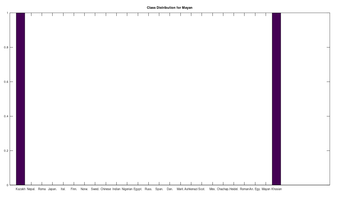
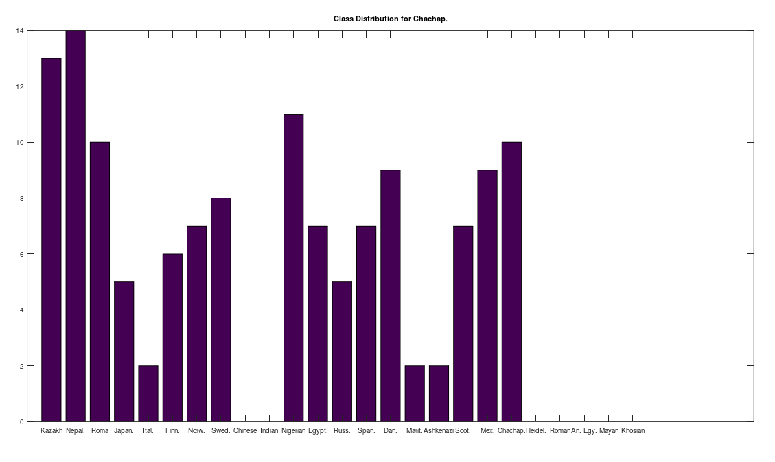
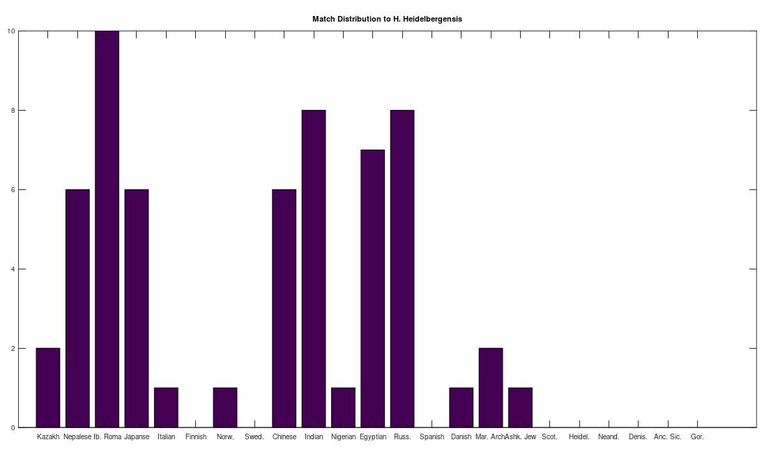
, since many genomes contain missing entries, which do not contribute to the threshold. Using this threshold produces the following three distributions for the Maritime Archaic, Mayan, and Chachapoya, respectively, in that order below. Keep in mind, you simply cannot argue with these results, since mtDNA does not change much from one generation to the next, and as noted above, the notion that matches on this scale are the product of chance is simply not credible, and so these groups are genetically related as set forth below. The vertical axis counts the number of times a given population matched to the population in question, and the horizontal axis gives the names of the individual populations.
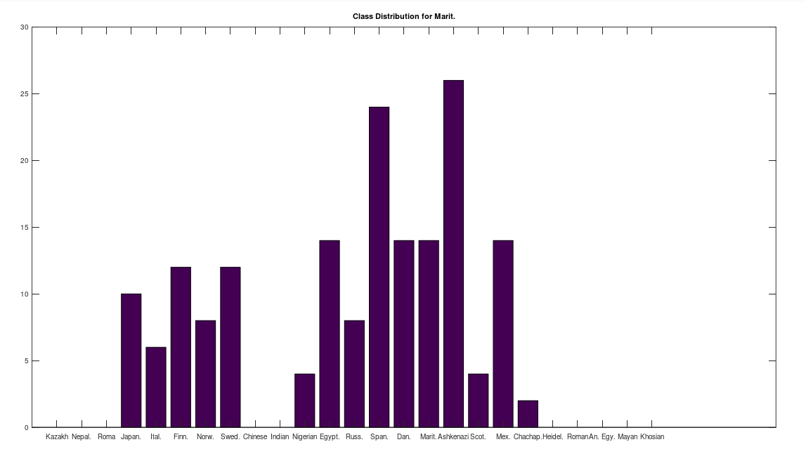
Some immediate takeaways, the Chinese and Indian populations are totally absent from these ancient American populations. This could of course be the result of the small dataset that contains only 10 genomes from each of China and India, whereas Russia is represented in both the Chachapoya and Maritime Archaic populations. If Russia were not represented, then that would be strange, given that at least some early settlers of the Americas are believed to have come over the Bering Strait. However, at a minimum, we can conclude that the Chinese and Indian maternal lines were not as well represented as the others above in the early Americas, which is not terribly surprising, since both are significantly further south than Russia.

One astonishing find, the Khoisan of Africa, believed to be one of the oldest living Homo Sapien populations, are a 99% match to the single Mayan genome. Because they are believed to be so ancient, I suppose they could end up anywhere, given the amount of time they’ve been around, but when you compare the Khoisan to the rest of the dataset, you don’t get a robust distribution, and instead get the same distribution, matching exactly once to a Kazakh genome, and the single Mayan genome, suggesting the possibility of a close genetic relationship between the Mayans and the Khoisan, and the Kazakh and the Khoisan. That is, it’s astonishing precisely because they don’t seem to be closely related to anyone else.

Another interesting note, the Iberian Roma and Nepalese people are plainly well represented in the Chachapoya population. This is very interesting, because both Iberian Roma and Nepalese are a near perfect match for Homo Heidelbergensis (approximately 97% of their mtDNA genomes are a match), an archaic human species that was thought to have gone extinct, though their maternal line plainly carries on in both populations. This suggests the possibility that Homo Heidelbergensis traveled with early Homo Sapiens to the new world, and at a minimum, that early ancestors of both the Iberian Roma and Nepalese people were present in the Americas.

I ran the same analysis on Ötzi the Iceman, whose genome is available from the NIH, but not included in the dataset below, and it seems he is also closely related to the Iberian Roma and Nepali people, producing the following distribution:

Attached below is all of the code you need to run the analysis, together with the dataset files:

https://www.dropbox.com/s/jla48icoyp3mqfy/Read_DNA_Seq_Revised.m?dl=0

https://www.dropbox.com/s/y19d8ein5wjxe3a/Genetic_Alignment.m?dl=0

https://www.dropbox.com/s/nen1ioluzil2x9w/Build_Human_mtDNA_Dataset.m?dl=0

https://www.dropbox.com/s/nrczoxeqezvnls1/Genetic_Preprocessing.m?dl=0

https://www.dropbox.com/s/nypxf52e4qc646h/Updated_Heidelbergensis_CMNDLINE.m?dl=0

https://www.dropbox.com/s/xacd04xdu9u1o63/mtDNA.zip?dl=0

The Structure of mtDNA

The methods I’ve been using to analyze mtDNA so far, have absolutely nothing to do with Haplogroups or even genes, and instead, I’m simply reading the entire genome, and treating every base as equally likely to provide information about nationality and heredity generally. So far, it’s worked really well, in that it produces incredibly efficient and accurate algorithms. However, I just developed a formal test of this method, and it turns out that the test is consistent with the notion that my method is actually better than looking at Haplogroups and genes. Specifically, I repeatedly ran Nearest Neighbor in two contexts, one where I incrementally increased the length of a contiguous sequence of bases (i.e., bases 1 through M, increasing M), and counted how many genomes mapped to their true nearest neighbor. Then, I increased the size of a random set of indexes, and ran nearest neighbor using only those indexes (i.e., increasing the size M of a random set of indexes from 1 to N, where N is the size of the genome). The chart below shows the number of genomes that map to their true nearest neighbor (y-axis), as a function of the number of bases in scope (x-axis). In order to be certain that neither was the result of an idiosyncratic outcome, the curves shown below are both the product of an average over 10 independent iterations. Specifically, for the sequential bases, I shifted the initial index each iteration, going from index K to K + M, thereby testing multiple independent starting indexes. If the sequence pushed past the end (i.e., M + K > N), I simply started again from other side using modular indexes (i.e., modulo N, causing e.g., N + 1 to map to 1). For the random bases, I simply generated 10 independent iterations of the algorithm, and took the average, since it produces random indexes anyway. There are again two applications of this method, and therefore two plots, one with M sequential bases, and the other with M random bases. The length of both curves is 34 entries long, and the random curve was superior (i.e., more rows mapped to their true nearest neighbor) for 33 of those 34 entries, again, using an average taken over 10 independent iterations.

The number of genomes that map to their true nearest neighbors (y-axis) as a function of the number of bases considered (x-axis). The random curve is on top in orange, the sequential curve below that in blue.

This is consistent with the hypothesis that by fixing the first M sequential bases in a genome, you actually learn less about the genome than you do by fixing M random bases. This suggests that for at least some purposes, disregarding potential genes and Haplogroups could be more useful, and is almost certainly more efficient. Interestingly, it is also consistent with an abstract notion of symmetry, where fixing a part of a system, implies some aspect of its whole, just like an axis of symmetry causes one set of points to imply another. In this case, a portion of the genome eventually implies a property of the whole, which is the nearest neighbor of the genome. This suggests a deep question, which is, what can be known about a random sequence? Yes, I’m assuming DNA genomes are Kolmogorov random, or close to it, and the point is, generally, what kind of predictions can be made given compressed instances of random systems? It seems like you can still predict the nearest neighbor of an mtDNA genome, given only part of it. This doesn’t run afoul of the notion of Kolmogorov randomness, since it doesn’t imply that you can compress the genome itself and still produce the genome. It does however, suggest the possibility that meaningful predictions can still be made given partial information about a random system.

Attached is code that allows you to run this analysis and generate the chart above, together with the dataset, which now contains 198 complete human mtDNA genomes.

https://www.dropbox.com/s/0ffauue8a1sabo9/mtDNA_CMNDLINE_Revised.m?dl=0

https://www.dropbox.com/s/nen1ioluzil2x9w/Build_Human_mtDNA_Dataset.m?dl=0

https://www.dropbox.com/s/xacd04xdu9u1o63/mtDNA.zip?dl=0

https://www.dropbox.com/s/4m6fhz77ki2rtg8/Genetic_Nearest_Neighbor_Fast.m?dl=0

https://www.dropbox.com/s/yw13jt0n4ip3598/Genetic_Nearest_Neighbor_Single_Row.m?dl=0

https://www.dropbox.com/s/nrczoxeqezvnls1/Genetic_Preprocessing.m?dl=0

mtDNA Classification Algorithm

As I noted previously, when you compare the complete human mtDNA genomes of two individuals that have a high match count, you produce a characteristic upward sloping curve. In contrast, if the two genomes have a low match count around chance, then it produces a downward sloping curve. Specifically, begin at index 1 of two aligned genomes, and calculate the average number of matching bases from index 1 to index K, and increase K over the entire genome. This is shown below, where 10 Nigerian genomes are compared to a single Japanese genome. As you can see, most of them are not a match, whereas some of them are (at the top).  This implies a fairly obvious classification and clustering algorithm, where two genomes are a match based upon the structure of the curve. Specifically, upward sloping is a match, and downward sloping is not. There’s a third case where the average number of matching bases plainly increases as a function of index, but isn’t a spot on match. If such a curve meets the minimum match count of 13,000 matching bases, and such a curve is the nearest neighbor of an input comparison curve, then it will be treated as producing a match. If however, either of those criteria are not met, then the comparison will be treated as a non-match. You can of course treat these cases differently, but this is how the attached algorithm functions.

The average number of matching bases (y-axis) as a function of genome index (x-axis).

Specifically, I produced a training dataset of 381 curves, by finding the nearest neighbor of each row in the dataset. If the input and its nearest neighbor have at least 13,000 bases in common (i.e., about 78% of the complete genome), then the resultant curve is stored, and its classifier is a “match”. In contrast, if the threshold is not met, the curve is disregarded. I then generated a dataset of “dudd” curves, i.e., non-matches, by finding the genome that has the lowest number of bases in common with an input genome. If this “furthest neighbor” has no more than 6,000 bases in common with the input genome, then the curve is stored as a “non-match”. If the match count exceeds 6,000 bases, the curve is disregarded.

I then compared every row in the genome dataset, which contains 200 complete mtDNA genomes from 18 nationalities, to a complete Homo Heidelbergensis mtDNA genome. This produces a curve for every row of the dataset, compared to Heidelbergensis, of the type shown above. I then ran Nearest Neighbor on the curve, over the training dataset, and tested whether the curve matches to a “good curve”, or a “dudd curve”. If it matches to a “good curve”, then the row is treated as a match for Heidelbergensis, and if instead it matches to a “dudd curve”, then it is not. The results are plotted below, which shows the number of matches, by nationality. As you can plainly see, many modern human beings have a very close genetic relationship to Homo Heidelbergensis, in particular the Iberian Roma, all of which are a match, using this methodology. If this sample is representative of the global population, then approximately 29% of the global population is closely related to this otherwise extinct archaic human population.

The number of individuals that match to Heidelbergensis, by nationality.

This is in some sense not terribly surprising, since, e.g., Icelandic people, and many Polynesians, carry significantly more archaic genes from ancestor species than most populations, specifically, Neanderthals and Denisovans, respectively. However, in this case, the match is strong, with many individuals that have more than 95% of their mtDNA in common with Heidelbergensis. In contrast, my understanding is that only a small portion of the complete Icelandic and Polynesian genome (i.e., all chromosomes, not just mtDNA), comes from archaic humans.

If you adjust the alignment, then the picture changes, with basically everyone producing a high match count, but this ignores the fact that many modern humans share the same insertions and deletions that are unique to Heidelbergensis. That is, this method aligns the genomes to what is plainly the standard NIH alignment, that has the exact same opening sequence of 15 bases for basically all of the genomes I’ve found, including all of the 200 genomes in this dataset, save for a few Japanese individuals that have minor deletions to this opening sequence. In contrast, taking a typical human mtDNA genome, and aligning it with Heidelbergensis in a manner that maximizes matching bases requires the deletion of roughly 300 bases. You can test this yourself by simply running a BLAST search on the Heidelbergensis genome that I used. In contrast, as you can plainly see, the individuals in the plot above match almost perfectly to Heidelbergensis, with no adjustment to the standard alignment. Note that all of the subspecies of Homo Sapiens contain exactly the same opening sequence of 15 bases, including Heidelbergensis, Denisovans, and Neanderthals, suggesting it is an objective alignment that is consistent across geography, and large scales of time, since Heidelbergensis was thought to have gone extinct several hundred thousand years ago. You can argue that this is in fact evidence that Heidelbergensis survived, and successfully assimilated into Homo Sapien populations, at least on the maternal line. 

As a general matter, these modern humans have a much closer genetic relationship to Heidelbergensis than others. Moreover, insertions and deletions are associated with significant morphological and behavioral changes in human beings, unlike point mutations, which can cause diseases, but don’t, to my knowledge, typically change appearance and behavior. This suggests quite plainly that a significant portion of the modern global population could have morphological and behavioral traits in common with Heidelbergensis.

Attached is the code, together with the dataset, that will allow you to run this same analysis. The dataset contains the assembled dataset, and the raw genome files, together with the provenance of each genome, i.e., a link to the NIH Database.

https://www.dropbox.com/s/q1bhj8i7b4udnjr/Temp%20Code.zip?dl=0

https://www.dropbox.com/s/xacd04xdu9u1o63/mtDNA.zip?dl=0

Symmetry and Natural Selection

I’ve noted countless times that Nature seems to select for beauty, and more generally, symmetry. Specifically, it’s astonishing that any species has integer symmetry. Consider the chain of events that lead to e.g., human beings having exactly two eyes, and five fingers on each hand. It’s simply extraordinary. To formalize this, consider a set of points in the plane. For every axis of symmetry in the shape, the probability of randomly generating that shape in the plane is reduced, for the simple reason that one point by definition defines yet another point under that axis of symmetry. If for example, there’s left-right symmetry, and we limit our considerations to a square with sides of length 1, and place the origin at its center, then every point with a negative x-value has a corresponding point with a positive and equal x-value. As a consequence, as you increase the number of axes of symmetry that is defined for a given set of points in the plane, you reduce the probability of randomly generating that set of points.

Returning to Nature, by selecting for highly symmetric morphologies, under the assumption that genetics controls morphology, which it obviously does, Nature therefore selects beauty presumably because it selects for highly unlikely genetic sequences, thereby reducing the probability that a mate has a trait generated by chance, which is associated with disease. More formally, if the mechanics that govern the replication of DNA, and protein production, of a given organism, can produce a highly symmetric and complex morphology, then it is reasonable that they can also control for the avoidance of random mutations, which are again associated with disease. This is consistent with the fact that people perceived as beautiful are actually healthier in general.

This also provides a theory of art rooted in natural selection, where again, an organism capable of producing complex and highly symmetrical objects can also likely control not only their behavior, but their faculties and bodily functions, again ultimately implying a genetic makeup capable of avoiding random mutations, that are again, associated with disease. In this view, art, and likely intellectualism generally, is a signal of genetic fitness, for the simply reason that the probability of randomly generating highly symmetrical and complex objects and ideas, is basically zero. Ironically, this brings us right back to DNA itself, since the probability of generating a DNA sequence that will actually produce a living organism is basically zero.

Modern societies create a feedback loop, because intellectualism also has economic value, in that inventions increase productivity, and at times make the previously impossible a reality. This suggests that societies that foster free and open creativity will likely outperform those that don’t, not just in terms of economic output, but also health, and reality is in accordance with this hypothesis. It also suggests that those that are hostile to the development of the arts, which is a real phenomenon historically, are for the same reasons, therefore instinctively hostile to the development of the awareness and production of highly complex yet structured artifacts, which could serve to train other human beings to recognize those aspects in others, presumably allowing them to select more fit mates. This suggests those that oppose the open expression of the arts, and intellectualism generally, are in this view a competing subspecies, with a possibly distinct criteria for reproduction, that is in all honesty not obviously prevalent in Nature, given the prevalence of symmetry.

Returning to the mathematics, and abstracting a bit, basically all strings are Kolmogorov random.  If you’re not familiar with the Kolmogorov Complexity, you should read this note. Applying this to Nature, Kolmogorov random morphologies do not exist, since there is always symmetry, in even DNA itself, which is highly structured and symmetrical. At the same time, you don’t find trivial symmetries either, suggesting that you will not find organisms with morphologies that have a low complexity compared to their scale. Instead, what you see is highly complex morphologies that nonetheless have macroscopic symmetries, and then further symmetries at even smaller scales of observations. The classic example is a Nautilus Shell.

A Nautilus Shell, courtesy of Wikipedia.

In fact, a Nautilus Shell forms a spiral, that can of course be modeled approximately by closed form equations, which is simply astonishing, suggesting again that Nature selects for morphologies that are certainly not Kolmogorov random, but at the same time, not trivial in terms of their complexity. This is echoed in art, where truly complex artifacts are sort of annoying, and generally relegated to aficionados, whereas at the same time, mundane pieces are rejected as simplistic. It is instead the combination of complexity and approachability that typically maximizes the appeal of a work. Just another example, trees are not symmetrical, though they have to be either balanced, or strong enough to withstand the asymmetry of the distribution of mass. However, they don’t have sensory organs, and have no obvious means of selection on the basis of aesthetics. However, leaves are symmetrical, suggesting some likely exogenous factor, perhaps again other species that select trees on the basis of appearance, by instinct, e.g., birds, or maybe even some bugs, that might spend more time in more symmetrical trees by instinct, thereby spreading the seeds and pollen of more symmetrical species. This should be testable, by simply presenting birds or bugs with two trees, one being highly asymmetrical or (perhaps simply unappealing) and the other more symmetrical (or perhaps simply more appealing). If there’s any clear bias, this could explain the symmetry of leaves and other plants that are too ancient for human beings to have selected. For intuition, imagine you’re on a date, and you have to choose between two trees, one that’s a mangy dilapidated mess, the other a fine and beautiful flowering cherry blossom. Human beings are capable of selection on sympathy, a sort of Charlie Brown syndrome, but most animals are not, if you haven’t noticed yet –

You don’t get perfect cross-sections from sympathy, at least not immediately, and Nature, what it is, seems to have little in the way of patience for its immediate endeavors.

Species and mtDNA Alignment

In a previous note, I pointed out that using the typical NIH mtDNA alignment, homo sapiens generally have the same 15 opening bases in common, despite the fact that mtDNA is circular, which are as follows:

GATCACAGGTCTATC

Note that this is too long to be credibly attributed to chance. I am assuming that the NIH alignment is the result of analysis that maximizes a metric related to the number of matching bases across their database, for a given species, that is then shifted to create exactly this common opening sequence (rather than e.g., beginning with a highly variable portion of the genome). Note that because mtDNA is circular, the exact order does not matter, provided the shift is consistent across the database, and so presenting the data in this manner makes perfect sense. I also pointed out that this creates two signature profiles when comparing genomes, one for two genomes that are a match (i.e., the two genomes have a high percentage of matching bases), and one for two genomes that are not a match (i.e., they have a low percentage of matching bases).

The average percentage of matching bases (y-axis) as a function of base index (x-axis).

Specifically, if you count the average number of matching bases from index 1 to index K, using the NIH alignment, and increase K, you find that if two genomes in fact have a high number of matching bases, the curve plainly converges to around 99% to 100%. In contrast, two genomes that don’t match instead diverge from a high matching percentage to around 25% (i.e., chance). This produces curves that are useful for Machine Learning, since it implies an unsupervised clustering algorithm, where two genomes are clustered together if they produce an upward sloping curve, and are otherwise, not clustered together. Note that you don’t have to test the overall matching base percentage using this method, and it is therefore totally unsupervised.

The plot above shows 10 complete Nigerian mtDNA genomes compared to a single Japanese genome. The x-axis is the genome index, and the y-axis is the percentage of matching bases, from index 1 up to the x-value. Most of the Nigerian genomes plainly do not match, and so they diverge, whereas some plainly do (converging at the top). There’s also an outlier in the middle, which you can consider as a third class that is a partial match, or simply disregard, as the bottom line is, this produces a useful unsupervised clustering algorithm that could be used to group mtDNA genomes beyond obvious geographies or other known connections.

I’ve expanded this inquiry into four other species formally, and several others anecdotally, and it seems the same is true of those species. Moreover, differences in the otherwise common opening mtDNA sequences are plainly associated with significant morphological distinctions. For example, the Gorilla and Chimp genomes in the dataset have perfectly consistent opening sequences of length 193 and 19, respectively. In contrast, the Goat and Carp genomes have consistent opening sequences of length 1 and 2, respectively, though closer examination shows that subsets of those genome groups have substantial overlap in their opening sequences. One sensible interpretation, is that a long, consistent opening sequence is unique to Humans, Chimps, and Gorillas. Another interpretation is that Humans, Chimps, and Gorillas, are within their own species morphologically roughly homogenous, whereas the same is plainly not true of Carp and Goats, both of which contain a wide variety of what could be fairly described as subspecies or breeds. The images below shows plain morphological differences between the Black Bengal Goat, and the Jamnapari Goat, including different coloring, hair lengths, horn shape, and face shape.

Bengal Black Goat (left) and a Jamnapari Goat (right).

It follows then that a morphologically consistent species such as the Emperor Penguin should produce alignments with a consistent opening sequence. Running a BLAST search for this specimen genome produces exactly that result, with a consistent opening sequence for the results returned. Simply look through the Alignment page, and you’ll note that there are no adjustments at all (i.e., the Subject index equals the Query index), and that the bases are consistent over the opening line of 60 bases. This is not a comprehensive study, but given that these are complete genomes, from a wide variety of human populations, and a reasonable number of non-human species, it is a credible hypothesis. Specifically, that variance in the opening sequence of an idealized alignment for a population of mtDNA genomes is consistent with significant morphological diversity. Further, it is also consistent with the hypothesis that the populations in scope should be subdivided until they produce a single opening sequence of appreciable length (i.e., beyond chance).

Emperor Penguins.

Note again that because mtDNA is circular, changes to the specific indexes are irrelevant, provided they are consistent, allowing us to compare what are then the opening sequences (i.e., shifting until we find the most consistent portion of the data across all genomes). In contrast, changes to the alignment that imply insertions or deletions are in fact significant. Moreover, in other contexts beyond mtDNA, insertions and deletions are plainly associated with morphological distinctions, specifically Down Syndrome and Williams Syndrome, as both produce distinct morphological changes to human beings, that are generally consistent in people with those disorders. Down Syndrome is due to a massive insertion, specifically an additional chromosome, and Williams Syndrome is due to specific deletions on Chromosome 7.

The net conclusion is that insertions and deletions in mtDNA seem to be associated with morphological variance, and because human beings are so superficially diverse, yet contain exactly the same opening sequence, it follows that the amount of variance required to generate significant differences in alignment should be quite drastic. There are however some examples within human populations that imply insertions and deletions, when compared to the majority of samples. Specifically, as I previously noted, some Japanese people have minor insertions and deletions to this opening sequence. More significantly, Iberian Roma are a near-perfect match with Homo Heidelbergensis (i.e., around 98% of bases matching), without any changes to the alignment of their mtDNA, using the standard NIH alignment. The code attached below will allow you to make this base-by-base comparison, without adjustment to alignment. In contrast, most other genomes in the dataset produce a number of matching bases around chance (i.e., around 28%) when compared to Heidelbergensis. This is astonishing, and running a BLAST search comparing e.g., an Italian genome to Heidelbergensis, the alignment is adjusted significantly, effectively deleting about 300 bases, producing again a match percentage of 97%. However, this completely ignores the observation that insertions and deletions are associated with drastic differences in morphologies, and behaviors. This at least suggests the possibility that populations that are close to Heidelbergensis, without adjusting alignment, have more in common in terms of appearance and behavior with Heidelbergensis, than those that don’t. At a minimum, it suggests that they have a closer genetic relationship to Heidelbergensis than the general population, that does not require adjustments to alignment to account for insertions and deletions unique to Heidelbergensis and some other apparently related populations. Note that both Iberian Roma and Heidelbergensis contain the exact same opening sequence above that is common to the vast majority of homo sapiens, suggesting that we are the same species, and simply variants of that species. The same is true of Denisovans and Neanderthals.

Below is some code that will allow you probe the dataset, together with the dataset itself, that now consists of 180 complete mtDNA human genomes from 18 geographic populations, 1 complete Heidelbergensis genome, and 20 complete non-human genomes from 4 different species, specifically, Gorilla, Chimpanzee, Goat, and Carp.

https://www.dropbox.com/s/i0ly3hlg0cvzet6/mtDNA_Prefix_CMDNLINE.m?dl=0

https://www.dropbox.com/s/br0krmjjkncms2t/Compare_to_H_Heidel_CMNDLINE.m?dl=0

https://www.dropbox.com/s/casfm3i07v0vefl/Count_Matching_Bases.m?dl=0

https://www.dropbox.com/s/lxq8gfb4h0p8edw/mtDNA.zip?dl=0

Information, Entropy, Novelty, and Time

Posit a source S 
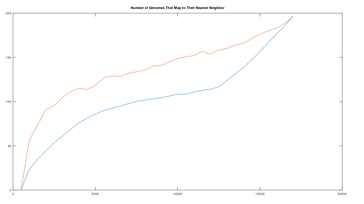
that produces signals over time, and assume that you record the signals generated. If S has a high entropy, then it is conceivable that the first several observations are all novel. To make this more concrete, assume S draws from a uniform distribution over \{1, 2, 3, 4, 5\}. The probability of producing two sequential observations is \frac{5}{25}. The probability of producing two unequal observations is instead \frac{20}{25}. As a consequence, it is more likely than not that the first two observations present two novel observations. Now assume instead that S draws from the set \{1, 2\}, with the probability of 1 at .99. This then implies that the probability of two novel observations is given by 0.0198, whereas the probability of sequential 1‘s or sequential 2‘s is given by 0.9802. As is evident, the higher the entropy of a distribution, the greater the likelihood of novelty, though I’ll concede this is not a formal proof.

This is interesting in and of itself, but there’s yet another consideration, which is that newness is associated with novelty anecdotally. However, we can now make this concrete, by treating novelty as a previously unobserved observation. This will produce an objective metric for novelty, which is given simply by the number of novel observations over time. That which is stable, is by definition unlikely to produce novelty. That which is volatile is by definition likely to produce novelty, with the entropy serving as a sensible measure of volatility. We have therefore yet another connection, which is to time. Specifically, in order for a source to have a low entropy, we must have a large number of observations. In contrast, a system can have a high entropy by simply having a large number of possibilities, for which we have e.g., only one observation for each. As a consequence, fixing our rate of observation, a system that has a low entropy must be old, in the literal sense, that we have a large number of observations, and therefore a significant historical record of its behavior. In contrast, a system that has maximal entropy requires only one observation of each state of the system, which by definition is the most likely outcome for any sequence of observations.

As a consequence, a low entropy system is consistent with a system that is old and stable. Note however, that a low entropy does not imply that it is old and stable, but is instead consistent with being old and stable. In contrast a high entropy system doesn’t really provide much information at all. And finally, this is consistent with my equation for Knowledge, given by I = K + U, where I would be in this case the maximum entropy of a source, and U is its entropy, leaving Knowledge as the balance between the two. Applied in this case, a low entropy system provides some knowledge about its history, whereas a high entropy system does not.

We can then consider the probability of novelty itself, disregarding the observed distribution of underlying outcomes. This allows us to consider the possibility of unforeseen events, and assign them a meaningful probability, as included in the category of novel events generally, which would in this view include unforeseen events.. This is something you cannot do generally with a fixed distribution. And again, we find that a low entropy distribution has a lower probability of producing novelty, when compared to a higher entropy distribution.