I’ve written a set of Octave algorithms that ultimately display connections between individuals based upon their mtDNA. The underlying process begins with a genome, finds its nearest neighbor, and then finds the nearest neighbor of that nearest neighbor, and so on, until it goes in a loop (i.e., until that process produces the same genome twice). The resultant paths are stored in a graph matrix, and the code then automatically generates code written in SageMath that allows you to visualize the results (i.e., you just copy / paste the SageMath code from a file that is automatically generated by the algorithms). The results are fascinating, and consistent with accepted theories, yet they also shed light on possibly new genetic connections. Here’s an example of a graph, generated for the Ashkenazi population, together with a color key on the right (also auto-generated by the algorithms).


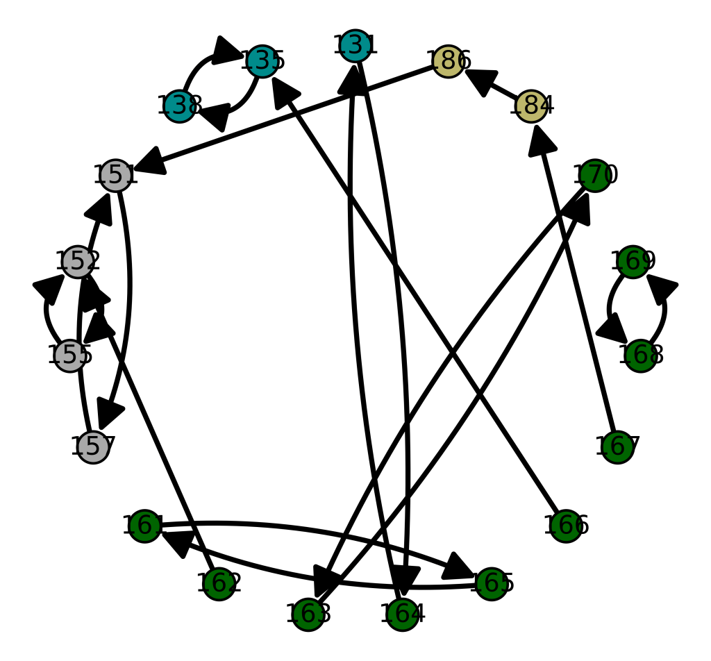
One obvious and surprising relationship is the apparent connection between Ashkenazi Jews and the Maritime Archaic people. You’ll note that the Maritime Archaic people are plainly self-related, just like the Ashkenazi Jews. When you plot the same graph for the Maritime Archaic (below), the Maritime Archaic rows in both graphs are also connected only to each other. Specifically, rows 151, 152, 155, and 157 are connected only to each other below. These are the same rows above connected to the Ashkenazi Jews. Most of the other Maritime Archaic rows, are not self-contained, and are instead connected to global populations, suggesting that just like the Ashkenazi Jews themselves, the Maritime Archaic people related to Ashkenazi Jews were also a tightly knit and homogenous population.


The vertex labels are the genome indexes (i.e., row numbers) in the dataset, and an edge from one vertex to another (directed) indicates that the sink vertex is the nearest neighbor of the source vertex. The color key for each population in the graph is again auto-generated, and is displayed on the right.


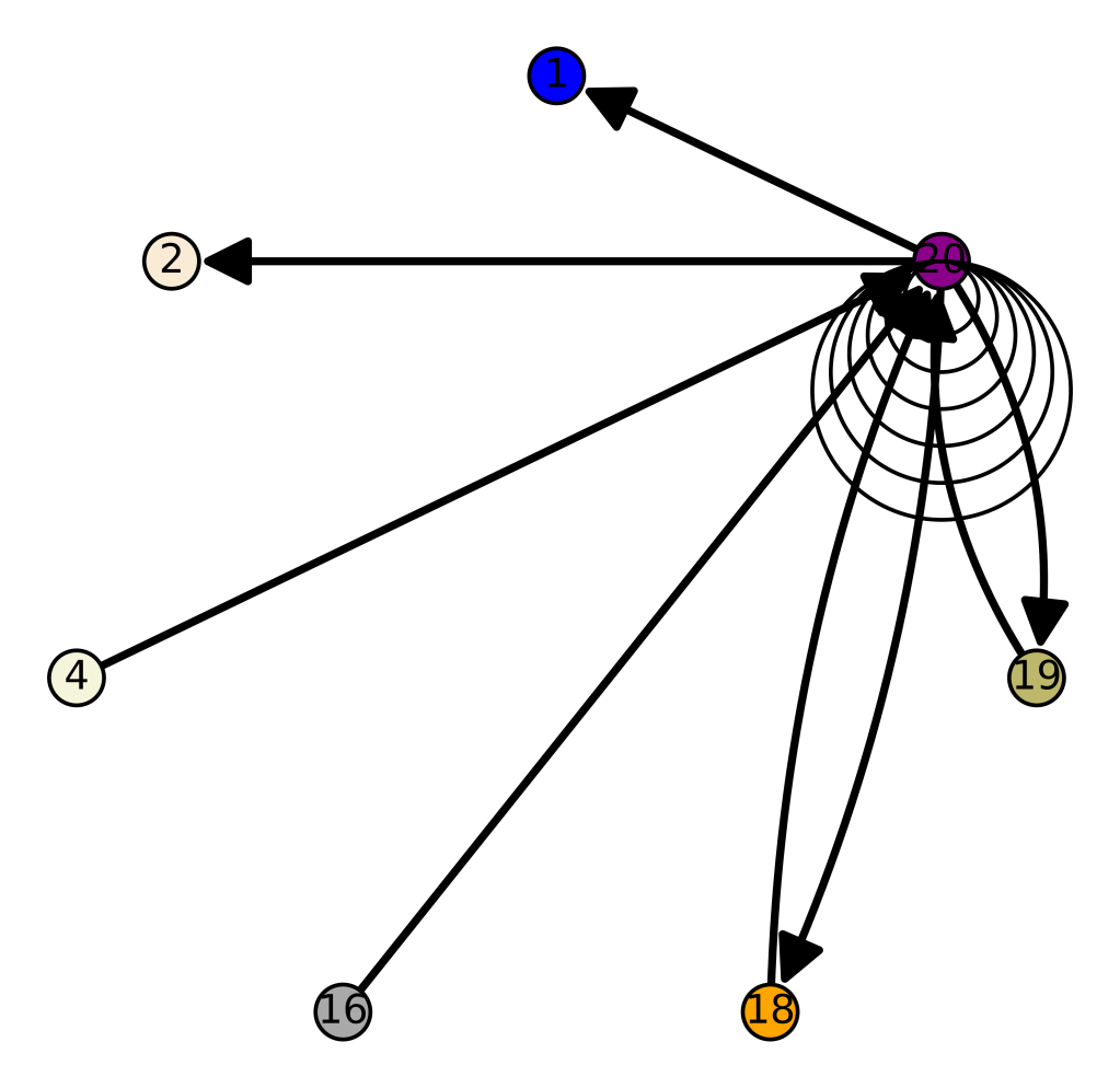
We can consolidate these graphs by class, causing e.g., all of the Maritime Archaic edges to be attached to a single vertex. This will show us the connections between populations, rather than individual genomes. This reveals some fascinating results, in particular, the Chachapoya people of Peru are connected to the Scottish, suggesting that the migrations to the New World started in the far West, and included many people along the way. The vertex labels on the left are the populations indexes, which don’t really have much meaning if you don’t look at the code, and so the color key on the right again provides the population names.
Below is the code and the dataset of genomes, which includes the raw genomes and links to the NIH Database files for each genome.
https://www.dropbox.com/s/xacd04xdu9u1o63/mtDNA.zip?dl=0
https://www.dropbox.com/s/yw13jt0n4ip3598/Genetic_Nearest_Neighbor_Single_Row.m?dl=0
https://www.dropbox.com/s/2p6yrgbbjnizq7u/Genetic_Chained_NN_CMNDLINE.m?dl=0
https://www.dropbox.com/s/f5voza7ak6il3zo/Chained_NN_ByClass_CMDNLINE.m?dl=0
Discover more from Information Overload
Subscribe to get the latest posts sent to your email.