In a previous note, I pointed out that many (and possibly nearly all) human mtDNA genomes “begin” (i.e., despite its circularity) with exactly the same 15 bases:
GATCACAGGTCTATC
In fact, because it’s circular, it makes perfect sense that there is a starting index, otherwise you run the risk of beginning protein production at different indexes, given the same genome, thereby producing different proteins. Other species seem to have their own opening ledes as well. A very small number of genomes in the NIH database do not contain this lede, but this is extremely rare in what I’m assuming is an enormous database, and though I haven’t done any formal analysis, I’ve found only about a dozen entries that do not contain exactly this sequence in the opening of their ideal alignment, using BLAST. That is, about a dozen genomes still contain this sequence, but not in the opening of the alignment that maximizes the number of matching bases. Further, some Japanese genomes contain minor deletions from this opening sequence, and therefore require minor adjustments to this alignment. In contrast, some of the genomes I found using BLAST require significant adjustments, effectively deleting around 570 bases from the genome, suggesting a significant deviation from a typical human mtDNA genome.
This suggests that as a general matter the correct empirical alignment for the human mtDNA genome begins with this sequence, despite the fact that it is circular, suggesting a useful and arguably “correct” starting point index, and this is in fact reflected in the NIH database, with basically all human mtDNA genomes I’ve found aligned with this opening sequence (including the roughly 200 complete genomes assembled in the dataset below).
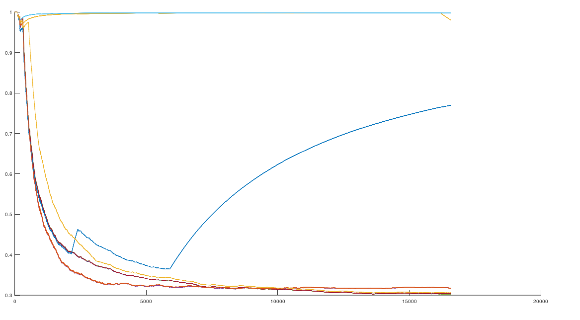
In that same note, I pointed out that if you use this alignment, which the NIH plainly does as a general matter, you find that matching genomes converge to a match, and genomes that don’t match, diverge. Specifically, if you count the average number of bases from index 1 to index K, and increase K, you find that two genomes that in fact have a high number of matching bases produce a curve that plainly converges to around 99% to 100%. In contrast, two genomes that don’t match instead diverge from a high matching percentage to around 25% (i.e., chance). This produces curves that are useful for Machine Learning, since it implies an unsupervised clustering algorithm, where two genomes are clustered together if they produce an upward sloping curve, and otherwise, not clustered together. The plot above shows 10 Nigerian mtDNA genomes compared to a single Japanese genome. The x-axis is the genome index, and the y-axis is the percentage of matching bases, from index 1 up to the x-value. Most of the Nigerian genomes plainly do not match, and so they diverge, whereas some plainly do (converging at the top). There’s also an outlier in the middle, which you can consider as a third class that is a partial match, or simply disregard, as the bottom line is, this produces a useful clustering algorithm.
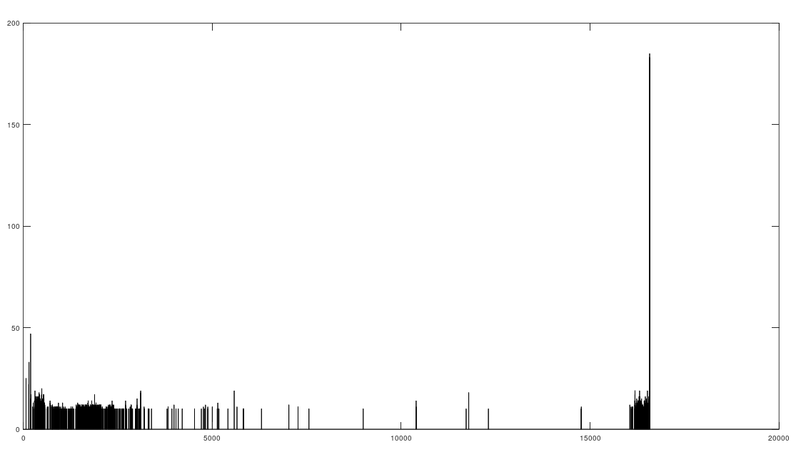
As I tested this more, I realized that you can also build a distribution of the indexes of unequal bases. Specifically, for each genome, run Nearest Neighbor, and find the indexes where that genome and its Nearest Neighbor differ. This will create a distribution, where each index is associated with some number of genome pairs that disagree at that index. The higher that number, the greater the number of instances of unequal bases at that index. When you plot this, you find exactly the same distribution, where the number of anomalously high unequal bases tapers off, which is consistent with the curves plotted above, that produce convergence as a function of index. The bar chart above shows all peaks that exceed the average plus one standard deviation, though you can of course make use of variations on this. Note the peak at the end is due to the fact that basically all of the genomes are missing that entry, causing all of them to be treated as unequal at that index (i.e., the algorithm first calculates equal bases, and disregards all missing entries, causing the compliment to include all instances of missing entries). Considering this further, it implies regions that are common to genomes are found in between the peaks of the chart above. This should make it easy to find genes, and more generally, sequences common to populations, which presumably have some function, even if it’s simply indicative of genetic grouping.
Specifically, the code attached produces 984 roughly homogenous regions. We can then calculate the length of each such region. The total sequence length of the homogenous regions is 15,592 bases, and the total length of the genome is 16,576 bases. This leaves 984 bases unaccounted for, as highly variable regions. This is approximately the length of the D-Loop, also known as the non-coding region, which apparently is a “hot spot for mtDNA alterations“. As a general matter, mtDNA is dense with genes, suggesting that we shouldn’t have too many inconsistent regions, and in fact we don’t. Moreover, you can plainly see that the inconsistent regions become more sparse, with a highly inconsistent and contiguous region in the beginning that could very well be the D-loop.
This is therefore an unsupervised algorithm that apparently correctly partitions this genome.
Here’s the code and the dataset:
https://www.dropbox.com/s/0y881tw2s7w91c8/Temp_CMDNLINE_12_18.m?dl=0
https://www.dropbox.com/s/4m6fhz77ki2rtg8/Genetic_Nearest_Neighbor_Fast.m?dl=0
https://www.dropbox.com/s/4m6fhz77ki2rtg8/Genetic_Nearest_Neighbor_Fast.m?dl=0
https://www.dropbox.com/s/casfm3i07v0vefl/Count_Matching_Bases.m?dl=0
Dataset:
https://www.dropbox.com/s/ht5g2rqg090himo/mtDNA.zip?dl=0
Discover more from Information Overload
Subscribe to get the latest posts sent to your email.
